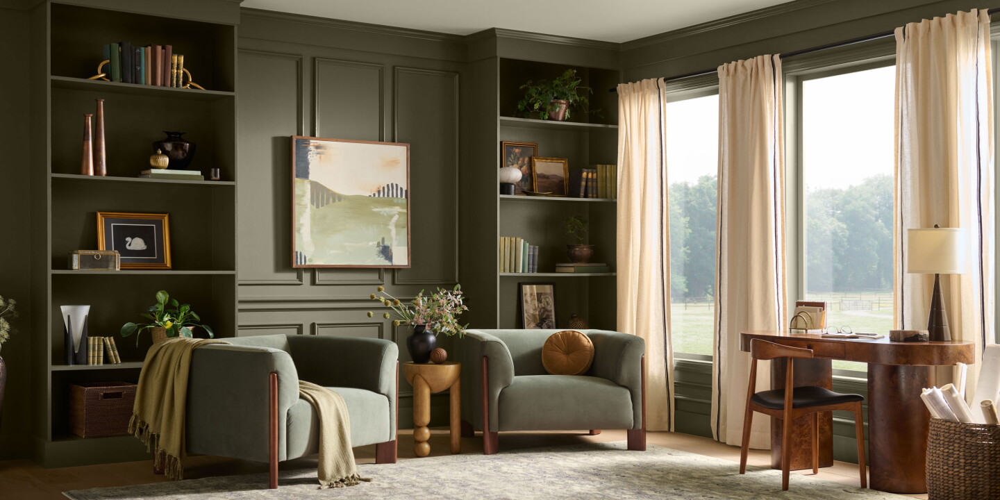
Behr’s 2027 Colour of the Year, Grounded, is a warm, mossy olive with brown undertones that the paint house chose to exemplify at Montage Healdsburg. The announcement — part trend forecast, part marketing exercise — underlines a clear hospitality design impulse: using colour and tactile materiality to deepen a guest’s sense of place.
Grounded sits squarely within a broader palette of natural blues, greens, browns and muted yellows that many designers are leaning on to translate landscape into interiors. At Montage Healdsburg, the tone is used alongside extensive glazing, timber, stone and soft linens so that vistas become a compositional element rather than mere backdrop. The result is less about dramatic accents and more about a sustained atmospheric thread that links exterior and interior.
Colour as contextual storytelling
What Behr’s pick emphasises is how a single hue can operate as a storytelling device across hospitality touchpoints. When a hotel adopts a colour rooted in the local ecology — olive for vineyards and oak, for example — it creates a consistent narrative that informs everything from wayfinding and signage to staff uniforms and F&B graphic design. Grounded’s earthy warmth makes it adaptable: in guest rooms it reads as calming and cocooning; in public spaces it anchors more textured materials and vintage metals without competing for attention.
Material pairings and sensory strategy
Colour decisions in hotels are inseparable from material and sensory choices. Grounded’s brown undertones work particularly well with aged metals, tannin-rich wood and tactile weaves, encouraging designers to think beyond paint to include upholstery, ceramics and ambient lighting that echo the same tone family. This approach supports the growing guest expectation for multisensory coherence — a room should smell, sound and feel as if it belongs to its surroundings, not merely wear an aesthetic veneer.
There are also operational advantages. Natural, mid-tonal greens tend to conceal wear better than pale or highly saturated colours, which can reduce repaint cycles in high-touch areas. From a merchandising angle, a hotel that visibly champions its palette can monetise it: paint chips, branded home-ware or a curated retail edit let guests take a piece of the stay home — reinforcing the hotel’s identity beyond the visit.
Why this matters to hospitality operators and creatives: adopting a place-led colour strategy like Grounded is an efficient way to strengthen brand distinction while improving guest comfort. For operators, it can cut maintenance costs and create new retail opportunities; for designers, it offers a durable, flexible foundation on which to build material palettes, lighting strategies and narrative-driven guest experiences that genuinely reflect landscape and locale.