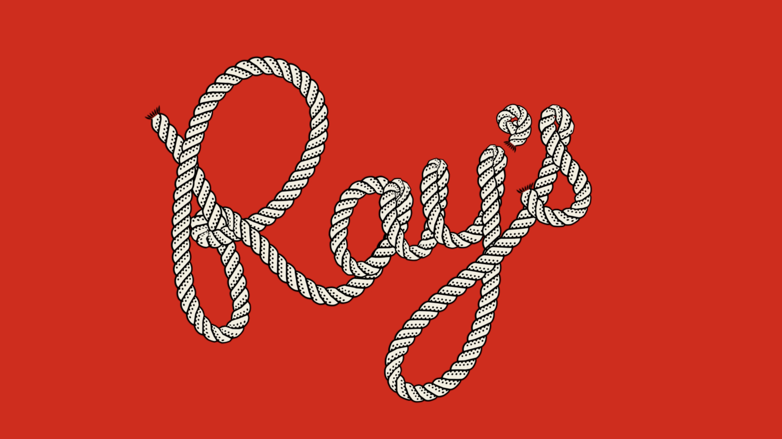
Base Design’s recent identity work for Ray’s Waterfront in Seward, Alaska takes a deliberately tactile, place-rooted approach: instead of erasing the restaurant’s 1980s origins, the agency amplifies them, building a cheerful, hand-crafted system that reads as a contemporary celebration of small‑town hospitality.
Respecting lineage while shaping personality
Base’s brief — to refresh a family-run seafood restaurant founded in 1988 — results in a strategy that foregrounds continuity. The new wordmark and signage explicitly reference the original red neon lettering, and the team collaborated with a local signmaker to recreate that façade presence. Rather than smoothing away imperfections, the design leans into them: flourished letterforms, a restrained palette of reds, creams and whites, and printed ephemera that feel intentionally physical. These decisions position the brand as authentic by design, signalling to locals and visitors alike that this is an established place with a clearly told past, not a generic seaside concept plucked from a trends playbook.
Craft, materiality and the politics of “authentic”
What distinguishes the project is its emphasis on material touchpoints and storytelling through craft. Motion treatments — notably a rope-like animation of the wordmark — illustrations by Jake Foreman and documentary-style photography by Jack Bool extend the brand’s maritime references into flexible assets that work across signage, menus, merch and social content. Even small items such as matchbooks and postcards are treated as opportunities to reinforce the mood of wish‑you‑were‑here nostalgia. The work acknowledges a familiar tension: celebrating “authenticity” can veer into pastiche. Base navigates that by ensuring every quirky flourish is rooted in something real — the founders’ photos, the building’s architecture, the town’s rhythms — so the result reads as affectionate rather than affected.
There are pragmatic trade-offs. Some typographic choices that sing in print — the use of Caslon’s Egyptian, for example — don’t always translate perfectly online, where legibility and perceived polish matter differently. Still, the project is clearly intended to live in the salty, tactile world of the harbourfront rather than as a slick digital-first identity; many elements are strongest when handled physically.
Why this matters to hospitality operators and creatives: Ray’s Waterfront demonstrates how a regional hospitality brand can be refreshed without losing soul. For operators, it’s a reminder that heritage assets — founder stories, signage, material culture — are valuable brand capital when activated carefully. For designers, the project underlines the value of cross-disciplinary craft: collaboration with sign-makers, illustrators and photographers yields a system that is coherent yet flexible. In short, this is a useful case study in doing less flashy, more faithful brand work that respects place, prioritises tactile experience and turns modest provenance into a distinct commercial advantage.