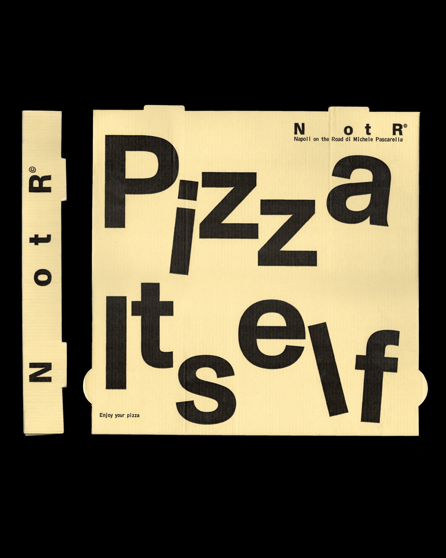
Antwerp studio Vrints-Kolsteren has translated Napoli on the Road’s itinerant origin into a pared-back visual system. The rebrand shortens the name to NotR and leans on transport and industrial signifiers — stamps, labels, monospaced typography and coded lock-ups — to communicate motion, history and an ambition that stretches beyond pizza.
A minimal name, a maximal narrative
Reducing “Napoli on the Road” to the terse NotR is a structural decision with narrative intent. Rather than erasing the past, the designers preserve absence: the gaps between letters act as semantic shorthand for movement and the traces of what once was. The truncation is economical — easy to reproduce at scale, quick to read on a delivery vehicle or social feed — yet it also signals a brand that has matured from a single food truck into a multi-site restaurant with cultural aspirations. That interplay between reduction and resonance is central to contemporary identity work: do less visually while layering more meaning.
Industrial cues as cultural currency
Where many Italian eateries default to warm scripts and folkloric illustration, Vrints-Kolsteren sidesteps cliché by mining the visual language of logistics and transport. Stamps, labels and monospaced type evoke freight, tickets and inventory systems — practical artefacts that imply movement, provenance and a working-class honesty. Applied across pizza boxes, menus and uniforms, these motifs give the brand a consistent tactile feel while remaining adaptable enough to inhabit non-hospitality contexts such as fashion or music. The choice of a functional aesthetic also helps the identity hold up in motion: on vans, staff jackets, and ephemeral event graphics the contrast of bold lock-ups and precise typography reads clearly at speed.
There’s also a smart material logic at play. Packaging becomes more than containment; it’s another surface for the identity to express itself through stamped marks and barcoded compositions. This approach respects the messy pragmatics of a restaurant business — deliveries, pop-ups, merch drops — and turns them into creative levers. It’s a modestly subversive move: turning the bureaucratic visual language of logistics into cultural signifiers that confer authenticity rather than austerity.
Visually restrained identities like NotR’s rely on rigorous rules to avoid becoming bland. The monospaced type, systematic spacing and stamp-like lock-ups provide that rigour, but the brand’s success will depend on disciplined application across touchpoints and the willingness to let graphic “errors” (wear, hand-stamping, scuffs) become part of the story rather than defects to hide.
Why this matters: For hospitality operators and creatives, NotR demonstrates how a brand can scale from a single truck to a broader cultural platform without resorting to decorative stereotypes. The project shows that carefully chosen industrial references and structural reduction can deliver both functional clarity (legibility, reproducibility, cost-effective packaging) and a distinct cultural voice — an attractive template for operators seeking longevity, merchandise potential and relevance beyond their immediate neighbourhood.