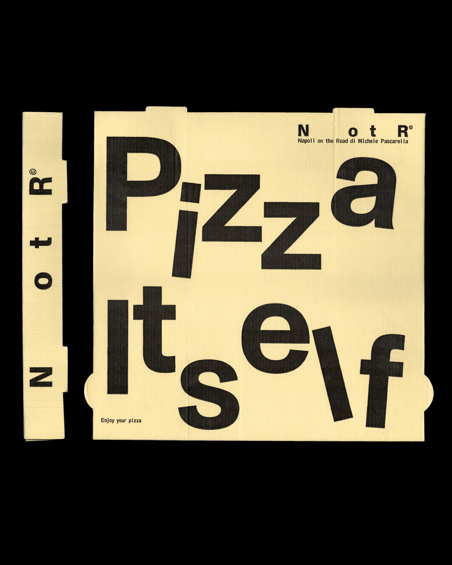
Vrints‑Kolsteren’s new identity for Napoli on the Road — now shortened to NotR — reframes a street‑to‑restaurant success story through the visual language of transport, shipping and industry. Moving away from the predictable tricolour scripts of Italian eateries, the Antwerp studio has translated motion and provenance into stamps, labels and coded graphics that reference the pizza business’s itinerant origins and its evolution into a multi‑site operation.
The designers pared the name back to an acronym, deliberately leaving the spaces between letters as negative traces of what was removed; a small, conceptual gesture that preserves lineage without literal nostalgia. Where many restaurant rebrands lean on illustrated ingredients or warm, artisanal cues, Vrints‑Kolsteren instead borrows signage systems — logistical marks, postal stamps, barcodes and stencil numerals — to make the restaurant feel less like a place that happened to travel, and more like a vehicle of journeying itself.
Material thinking over picturesque cliché
What stands out is the choice to work with the physical language of movement rather than with decorative, affective imagery. The identity operates through typographic condensation, modular marks and label‑like appliqués that could be applied across boxes, uniforms, menus and vehicle liveries. This is a practical, cross‑platform strategy: labels and stamps scale well, are legible at distance and perform across printed, digital and three‑dimensional surfaces. By anchoring the look in systems used for transport and freight, the studio gives NotR a durable toolkit that reads coherently whether it’s on a delivery crate, a storefront, or a social tile.
Heritage as trace, not picture
The approach reframes origin story as residue — an absence that still informs identity — rather than as a motif to be literally depicted. That restraint is notable: it resists turning ‘Napoli’ into a pastiche of clichés and instead translates the brand’s history into designed artefacts that imply movement, accumulation and routes travelled. The palette, typographic choices and utilitarian marks signal efficiency and authenticity without romanticising them; they suggest a business confident enough in its reputation to let function inform aesthetics.
For hospitality operators and creatives this project matters because it demonstrates a strategic alternative to heritage branding. Rather than rely on nostalgic illustration or overt cultural markers, designers can excavate operational and material realities — logistics, wayfinding, packaging — to build identities that are both distinctive and eminently deployable. NotR’s rebrand shows how a brand’s lived practices (travel, delivery, iteration) can become its most convincing visual language, creating an identity that supports growth across formats and locations while keeping the story of movement front and centre.