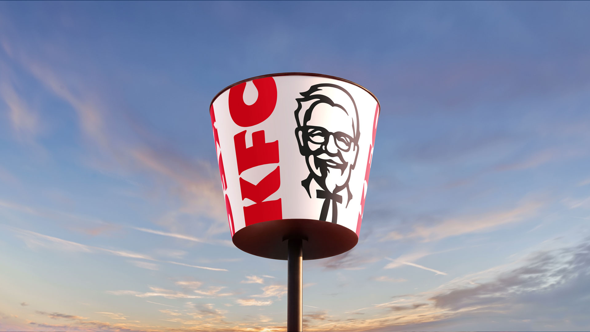
KFC has unveiled a global rebrand that literally reframes the business around its most recognisable artefact: the bucket. The overhaul, led by branding agency JKR and rolled out in mid‑2026, treats the bucket as a central visual and experiential device — a “Bucketverse” that ties refreshed packaging, a subtle update to the Colonel, new typography and a broader restaurant and menu strategy into a single system.
Design: an icon becomes a system
Rather than replacing familiar marks, the redesign amplifies them. The bucket is no longer just a delivery container; it acts as a framing device, lens and emblem — used as a compositional device across photography, motion and illustration. The Colonel remains present but more measured, while the logo, letterforms and colour palette have been evolved to support modular usage across screens, packaging and large-format environments. New type work and identity elements developed with specialist studios underpin a more contemporary, three‑dimensional approach that aims for flexibility without erasing the brand’s heritage.
Beyond visuals: product and place are part of the identity
This is a brand play with operational muscle behind it. The rebrand coincides with tangible changes to menu and venues: a push towards boneless, “dippable” menu items, a renewed focus on sauces, and an expanded Kwench beverage platform. KFC is also trialling next‑generation restaurant formats — from an open‑plan outlet in McKinney, Texas, to a two‑storey flagship in Dubai — signalling that the visual system is intended to scale into real, physical experiences rather than only adorn advertising campaigns.
Creatively, the project uses the bucket concept to organise content and storytelling: photography shot through a so‑called “bucket lens” reframes food and people within a consistent viewpoint, while an illustration programme sourced from global artists adds local texture within a unified frame. The resulting toolkit is intentionally expansive — a toolkit designed to make the bucket legible at postage‑stamp scale on a phone screen and as a beacon in a multi‑level dining atrium.
There are pragmatic risks baked into such a big, concept‑led move. Turning packaging into a primary mark depends on consistent global execution and on consumers accepting a symbolic shift: a bucket-centric identity must still read as KFC everywhere from drive‑thrus to delivery apps. Operationally, the menu and format changes must deliver on taste, price and convenience or the visual investment will ring hollow. But if executed well, the system gives KFC a single, easily recognisable asset to deploy across markets and media — an advantage in an increasingly crowded quick‑service category.
Why this matters to hospitality operators and creatives: the KFC relaunch is a reminder that brand identity can — and increasingly must — extend beyond logos into product, service and space. For operators, the lesson is to align design refreshes with tangible service or menu innovations so visual changes are supported by customer experience. For creatives, the project demonstrates the value of elevating everyday props into organising principles: a simple, culturally anchored asset, treated consistently, can become the connective tissue across physical venues, packaging and digital touchpoints.