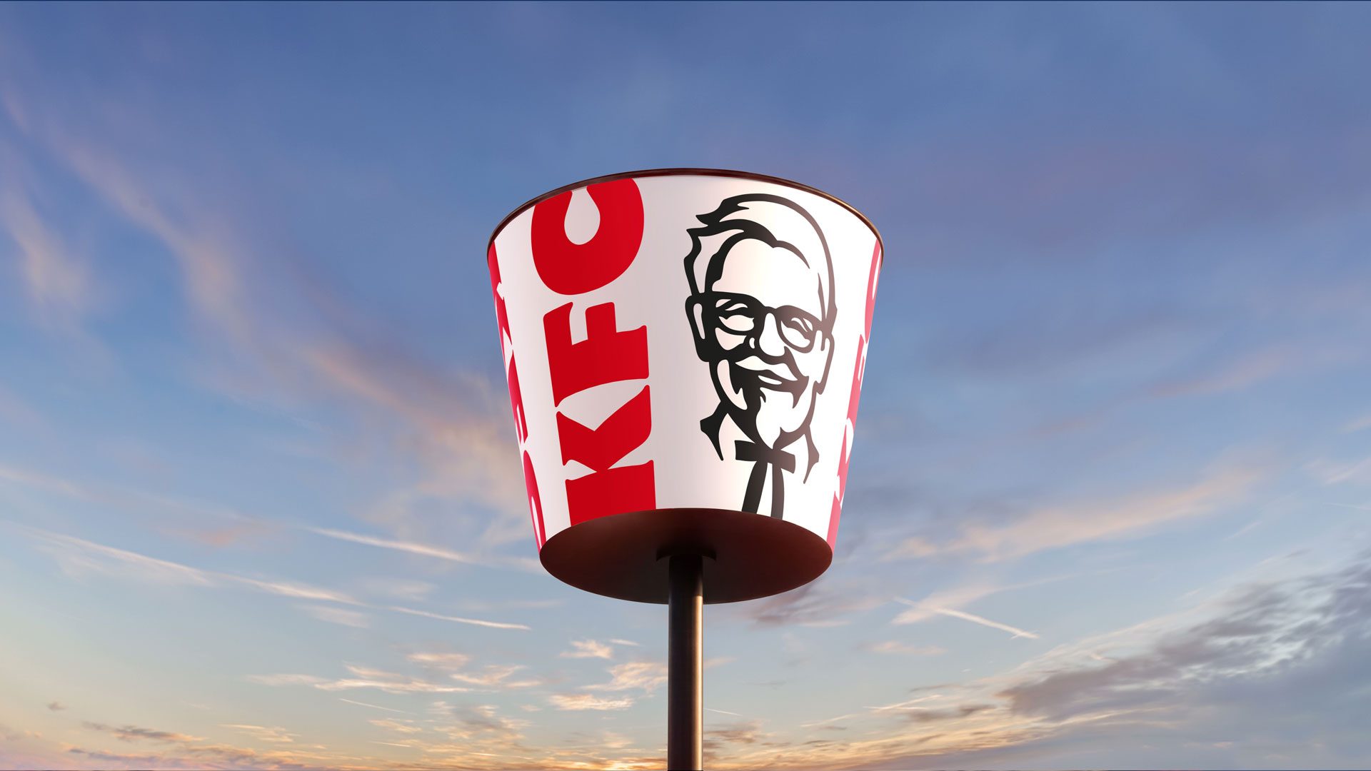
KFC’s recent global rebrand places its most recognisable prop — the red-and-white bucket — at the centre of a new visual universe. Developed with Jones Knowles Ritchie (JKR), the refresh reframes packaging as a storytelling device and extends the bucket into a mascot‑like character and a flexible identity system intended to run across restaurants, digital touchpoints and product launches.
Rather than replacing the brand’s familiar assets, the strategy amplifies them. The bucket becomes a framing device — a literal portal for illustrations, motion and localised creative — and, in some executions, a sentient character with glossy eyes and playful 3D elements. The update includes a tightened wordmark and bolder graphic language, an expanded colour palette and a typographic system designed for clearer hierarchy across menus, apps and OOH. Crucially for a 150‑country operation, the system is modular: it can be dialled up or pared back depending on market needs and real‑estate constraints.
Design logic: ownership through amplification
The move exemplifies an evolutionary rebrand that prioritises ownership over reinvention. KFC’s bucket is a uniquely ownable silhouette — more distinctive than a strapline or character in many contexts — and the agency has treated that shape as the primary asset to orchestrate brand expression. This reduces the risks that come with wholesale identity swaps while creating new opportunities for storytelling. By turning packaging into an active element of creative campaigns, the brand gains a repeatable motif that works at multiple scales: an app icon, a takeaway sleeve, an immersive in‑store installation.
Executional implications and potential pitfalls
Execution will determine whether the repositioning feels strategic or gimmicky. The success of a characterised bucket and exuberant 3D assets depends on consistent application and a disciplined tone of voice across markets; overly literal or inconsistent uses could dilute the asset’s potency. There are also operational considerations: revising physical packaging, signage and interior wayfinding across thousands of franchised restaurants is capital‑ and logistics‑intensive. That said, the modular nature of the system helps manage roll‑out complexity — it allows markets to prioritise high-impact touchpoints first, then cascade the rest over time.
Why this matters to hospitality operators and creatives: the KFC rebrand is a reminder that powerful branding often comes from doubling down on what is already recognisable rather than inventing new symbols. For operators, it underlines the value of treating packaging and fixture design as revenue‑bearing assets that can carry narrative and drive merchandising. For designers and marketers, it showcases a pragmatic model for large‑scale identity work: choose a singular, ownable device, make it flexible, and create rules that enable vibrant local interpretation without surrendering coherence.