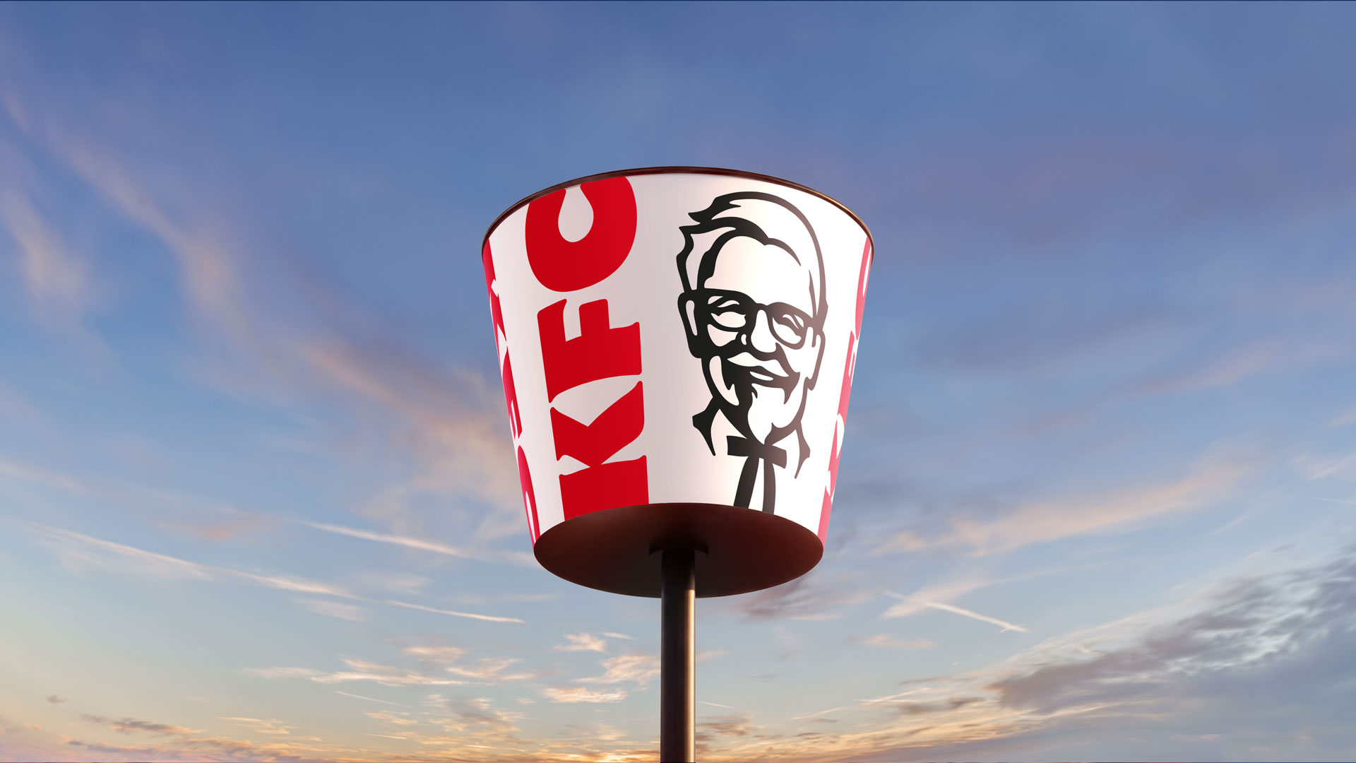
KFC has launched a global rebrand that places its most recognisable asset — the red-and-white bucket — at the heart of a new, system-wide identity. The refresh, created with agency JKR, reframes the bucket as a framing device and character within what the brand calls the “Bucketverse,” extending across packaging, typography, restaurant design and product storytelling.
What changed: a single asset as the system
The redesign does not rip up KFC’s heritage; instead it elevates the bucket from functional packaging to the principal semiotic anchor of the brand. JKR treats the bucket’s silhouette as a universal frame that can host photography, illustration and motion, while the Colonel and the red-and-white stripes are retained and refined. The new approach also introduces bespoke typefaces and playful 3D and illustrative work that make the bucket feel both narrative and native to different markets.
Design mechanics and global roll-out
Practically, the rebrand unifies disparate touchpoints: in-store environments, digital apps, packaging and marketing will use the bucket outline as a compositional rule, which helps ensure instant recognition even when the full wordmark or Colonel portrait is absent. JKR’s work includes expanded visual motifs — from animated ‘sentient’ buckets to saturated food photography framed by the bucket cut-out — and bespoke type to support large-format storytelling. The rollout began in mid‑2026 and is staged across territories through the year, with pilot restaurant concepts and experiential sites forming part of the programme.
Beyond visuals, the refresh accompanies a business strategy: KFC is linking the identity overhaul with menu and service initiatives (notably sauce-led offerings and a renewed focus on tenders and beverages) so the design system supports product storytelling rather than existing as a purely aesthetic exercise. Observers have noted the brand’s aim to make the bucket legible to younger audiences while preserving the recognisable cues that anchor long-time customers.
This is a confident, reductive move — choosing one highly ownable form and squeezing the brand’s vocabulary through it. The strength of the strategy depends on two things: rigorous application across thousands of franchise touchpoints, and operational follow-through so that experience matches the promise of the new visual world. If execution is uneven, the bucket could become a reminder of inconsistency rather than a unifying emblem.
Why this matters to hospitality operators and creatives: the KFC rebrand is a reminder that iconic brands can gain clarity by amplifying a single, culturally resonant asset rather than inventing new ones. For operators, the lesson is operational: visual coherence must be paired with consistent product and service delivery. For designers and brand strategists, it’s a case study in system thinking — using a simple, scalable shape as both a design rule and a storytelling device to unify global experiences while allowing local creative interpretation.