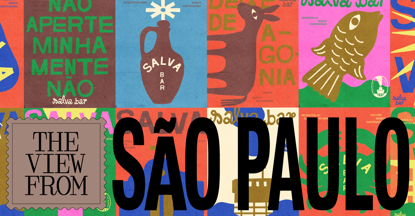
São Paulo’s hospitality scene is seeing a distinct turn towards retro-inflected visual identities. Designers and studios are mining mid-century typography, analogue print textures and local ephemera to give new bars and restaurants a warmer, more playful personality that sits in deliberate contrast to the cool minimalism that dominated the previous decade.
How the aesthetic is being assembled
Rather than a single look, the retro impulse in São Paulo is pragmatic and plural. Practitioners repurpose vernacular objects — record sleeves, poster art, refrigerated deli signage and type treatments found in old literary editions — as starting points, then translate those references into contemporary assets: wordmarks that wink with small illustrative details, simplified geometric forms that echo vinyl records, and palettes chosen for felt warmth rather than stark neutrality. Where a purely typographic logo once sufficed, identities now extend into illustration systems, menu templates, printed posters and tactile collateral that work together to deliver a recognisably human, imperfect texture.
Craft techniques meet commercial needs
Behind the nostalgia is a clear emphasis on craft and repeatability. Studios are borrowing analogue cues — halftone dots, ink overlaps, muted gradients — but rendering them in ways suitable for modern production across digital menus, social platforms and signage. This allows operators to keep the ‘authentic’ feel while retaining consistency and scalability. Importantly, the retro approach often leans on local cultural markers and oral histories, so the result feels rooted in neighbourhood context rather than being a generic vintage pastiche.
The effect on customer experience is immediate: warmer visual tones and playful details lower the barrier for casual visits, suggest a relaxed pace, and cue conviviality. For night-time venues that prioritise music and lingering, the visual language can also signal curation — a listening bar’s graphics might reference vinyl geometry, while a small plates spot will adopt poster-driven compositions that suggest convivial sharing. The identities frequently work as staging devices too, shaping how interiors, uniforms and printed menus are perceived as parts of a single dramaturgy.
Why this matters for operators and creatives: for hospitality businesses seeking differentiation in crowded urban markets, retro-informed branding offers a reliable shorthand for warmth, familiarity and distinctiveness. For designers, it presents a design brief that values cultural research, tactile production choices and systems thinking over trend-chasing. Both sides benefit from the strategy’s commercial advantages — clearer storytelling, stronger social-media presentation and higher perceived hospitality — but the approach only succeeds when the visual cues are anchored to genuine local references and operational realities, not merely aesthetic nostalgia.