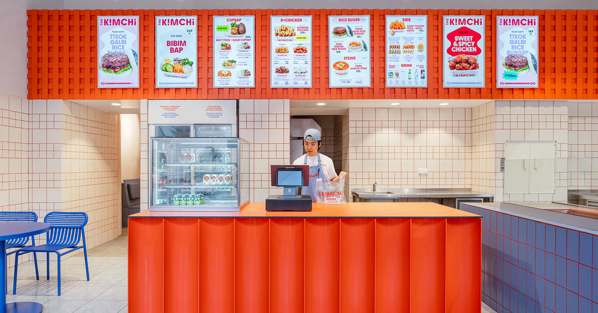
SOA Architekti’s fit-out for The Kimchi in Prague translates the kinetic visual vocabulary of Seoul into a compact, quick‑service restaurant. The brief—to evoke the energy of Korean street food rather than reproduce literal cultural motifs—has been realised through a bold, limited palette and a handful of material gestures that rework ordinary finishes into an unmistakable identity.
Arranged within the footprint of a former pastry shop adjacent to Masaryk Railway Station, the scheme stitches together existing spatial quirks with a new graphic order. A dominant cobalt blue ties together tables, bench seating and some wall planes, creating an unexpected calm field that readies the eye for sharper notes. Against this base, a grid of white tiles with red grout becomes a large‑scale graphic, while a suspended orange mesh above the counter adds texture and a rooftop‑like canopy of colour. The result is economical but emphatic: inexpensive materials are elevated by colour and composition into something memorable.
Colour as structure, not decoration
What makes The Kimchi notable is how colour functions structurally rather than as mere surface dressing. Blue acts as a unifying primacy, shaping circulation and seating zones so the interior reads as a sequence of coordinated moments. Red—delivered through the unusually visible choice of grout—turns a common utilitarian finish into a deliberate graphic device, reinforcing vertical and horizontal geometry. Orange, deployed as a lightweight, industrial mesh, provides a tactile counterpoint that registers in photos and in person. These choices show how restrained palettes can create layered depth without resorting to heavy ornamentation.
Contemporary identity without pastiche
SOA’s approach sidesteps clichés often found in themed ethnic restaurants by prioritising atmosphere and attitude over iconography. Rather than applying familiar cultural signifiers, the design abstracts the “visual energy of Seoul”: contrast, saturation and graphic rhythm. This strategy produces a contemporary identity that feels referential rather than illustrative—appropriate for a fast, urban format where clarity and legibility of brand are paramount. The use of everyday materials—ceramic tiles, metal mesh, painted wood—also signals a pragmatic understanding of cost and durability for a high‑turnover site.
For hospitality operators and creative teams, The Kimchi is a useful case study in translating a destination’s spirit through selective, high‑impact moves. The design demonstrates that strong brand impression need not depend on expensive bespoke fittings: strategic colour, a small number of distinctive material interventions and a clear spatial hierarchy can yield a recognisable, photographable identity that supports both service efficiency and narrative. In short, it’s a reminder that thoughtful restraint often beats decorative excess when creating contemporary, culturally attuned hospitality spaces.