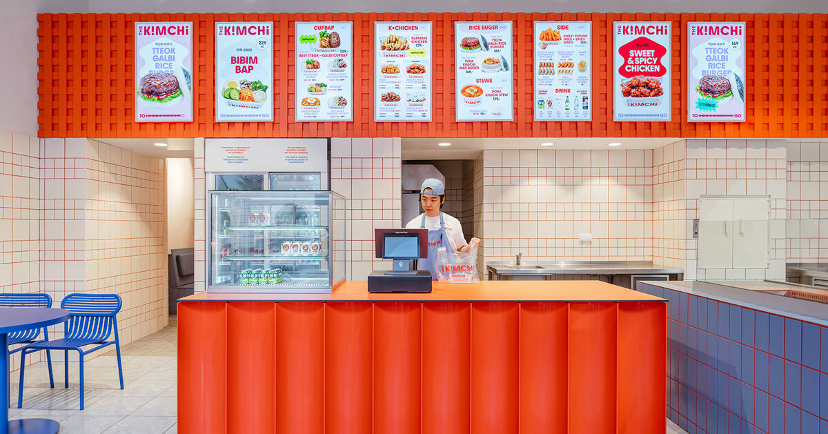
SOA architekti’s fit‑out for The Kimchi, a compact Korean street‑food counter beside Prague’s Masaryk Station, translates Seoul’s kinetic visual language into a tightly choreographed dining experience. Through a restrained material palette, a recurring wave motif and a trio of saturated colours, the project aligns spatial choreography, branding and operational clarity within the bones of a former pastry shop.
Colour as wayfinding and cultural shorthand
Rather than rely on literal cultural artefacts, the design uses a bold colour strategy—blue as the primary field, with accents of red and orange—to suggest Seoul’s neon‑charged energy without pastiche. Blue is applied broadly across seating, tabletops and selected wall planes to establish a coherent visual field; red appears more surgically, most notably as a grout that animates otherwise ordinary white tiles, while an orange mesh above the service counter introduces texture and depth. The resulting palette performs multiple roles: it reads at a glance to pedestrians outside, organises zones inside and creates a recognisable identity that can be replicated across signage and graphic collateral.
Graphic motif and revealed process create a single narrative
A fluid wave motif—loosely referencing shapes from the Korean flag—runs through exterior signage, wall graphics and the service counter, knitting the spatial and graphic identities together. This singular gesture operates like a brand spine, guiding sightlines from the street to the open counter where final assembly of dishes takes place. The architects keep the kitchen choreography visible but contained: a back‑of‑house area prepares fresh ingredients daily, while the finishing work happens in full view of diners. That transparency supports a street‑food model (fast, visible, quality‑focused) and helps manage expectations in a small footprint.
Material choices are pragmatic and budget‑aware: tiling, painted surfaces and industrial mesh offer durability while allowing saturated colour to feel intentional rather than ornamental. The decision to retain elements of the former pastry shop’s layout demonstrates a common approach for urban infill projects—respecting existing geometry while inserting a strong, contemporary overlay that reads well in photographs and at the street edge.
Why this matters to hospitality operators and creatives: The Kimchi is a compact lesson in aligning brand, operations and urban presence. For operators, it shows how a limited menu and visible prep can amplify perceived quality and speed in a small space. For designers, it demonstrates that strategic use of a few saturated colours and a recurring graphic motif can create a distinctive, reproducible identity without expensive bespoke fittings—an efficient route to memorability in a crowded city market.