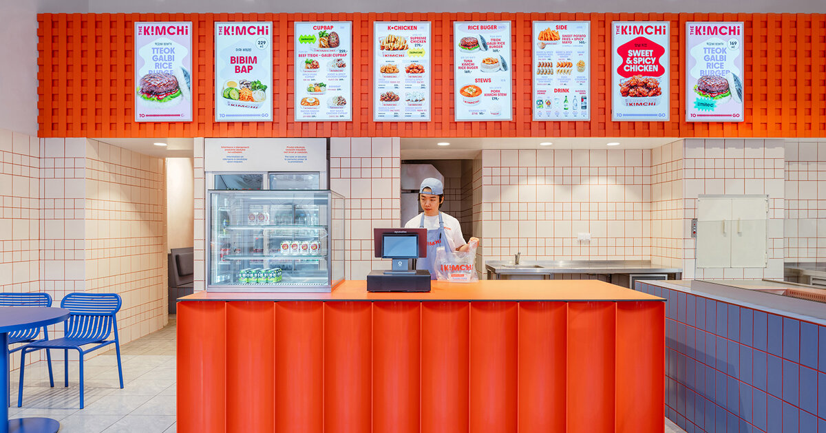
SOA architekti’s fit-out for The Kimchi in Prague distils contemporary Seoul into a compact street‑food counter: a restrained set of material moves and a tight triadic palette — cobalt blue, vivid red and orange — deliver a recognisable, kinetic identity without resorting to literal or folkloric signposting.
Colour as architectural shorthand
The most immediate character of The Kimchi is its colour strategy. Cobalt blue anchors the space — applied to seating, tables and lighting — while a conventional white tile grid becomes a graphic instrument through the decision to use bright red grout. An industrial‑style orange mesh hovers above the service counter, adding texture and a secondary warm note that animates the ceiling plane. Together the three colours reference Korean visual culture (and, implicitly, the Taeguk palette) but are deployed as compositional devices rather than decorative clichés. This allows the interior to read as contemporary and urban: bold at a glance, legible from the street and compact enough to suit the restaurant’s quick‑service programme.
Operational transparency meets graphic composition
The project occupies a modest footprint beside Prague’s Masaryk Railway Station and was realised inside a former pastry shop, conditions that demanded spatial economy. SOA architekti respond by making the service counter a focal and connective element: cooking and preparation are visually accessible, framed by the orange mesh and the white tile backdrop. The grid motif — tiled walls and tile‑framed openings — does double duty as practical finish and as a graphic device that ties the interior to the brand identity. Furniture and lighting are pared back, emphasising efficiency and turnover while the saturated colour applications do the heavy communicative lifting.
Crucially, the design sidesteps the temptation to accumulate obvious cultural signifiers. There are no hanok screens or literal folk motifs; instead the practice translates ‘Seoul energy’ into rhythm, contrast and scale. The result is not a themed mise‑en‑scène but a distilled spatial language: concise moves repeated and calibrated so the tiny restaurant punches above its physical size in both presence and memorability.
Why this matters for hospitality operators and creatives: The Kimchi demonstrates how a small operation can achieve a strong, culturally specific identity without expensive or elaborate interventions. A disciplined palette, a few well‑chosen material gestures and a transparent service model can create a recognisable brand experience that supports fast turnover, wayfinding and social media visibility. For designers, the project is a useful reminder that authenticity can be achieved through selective abstraction — extracting the character of a place (its colour, tempo and graphic culture) and translating those qualities into economical architectural moves that work operationally as well as visually.