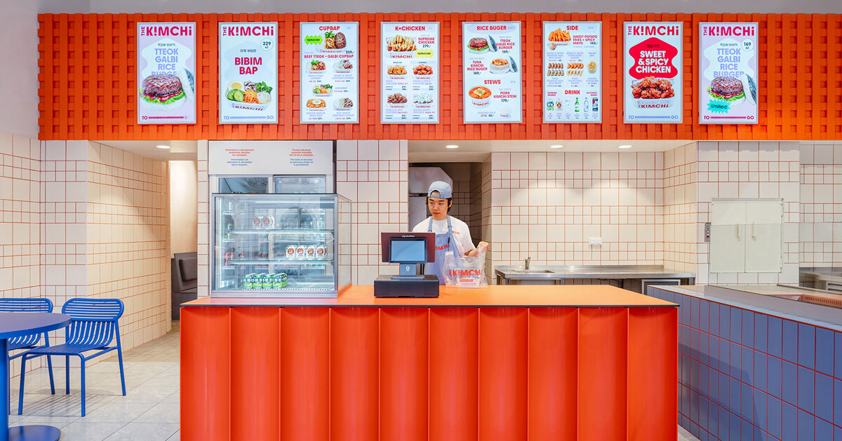
Situated beside Prague’s Masaryk Railway Station, The Kimchi by SOA architekti translates the kinetic, saturated visual language of Seoul into a compact Korean street‑food counter. The architects kept the original pastry‑shop bones but layered a disciplined palette and a single sweeping motif to make the space feel both local and unmistakably referential to contemporary Korean culture.
Colour as cultural shorthand, not pastiche
Rather than relying on artefacts or literal references, the interior hinges on colour and proportion to signal its cultural source. A dominant blue — used across tables, bench seating and lighting — establishes a consistent visual field, while accents of red and orange punctuate surfaces and details: red grout animates the white tile grid, and an orange mesh overhead introduces texture above the service counter. The effect is less about reproducing Seoul’s streetscape and more about capturing its energy: a compact composition of contrasts and saturations that reads immediately as contemporary Korean without tipping into cliché.
The motif and the choreography of service
SOA architekti deploy a single dynamic wave, loosely inspired by elements of the Korean flag, which threads through signage, the serving counter and wall graphics. This continuity performs two functions. Practically, it unites discrete parts of a narrow plan — entrance, open kitchen, counter and seating — turning them into a legible sequence for diners and passers-by. Conceptually, the motif works as a branding device: repeated at differing scales and materials it becomes the restaurant’s identity, enabling the architects and owners to integrate graphic identity with the built environment without added applied signage or décor clutter.
The plan privileges visibility and flexibility. An open counter allows preparation to be part of the spectacle, while simple, moveable seating supports different group sizes and turnover patterns typical of street‑food operations. Materials are economical and robust — tiled walls, metal mesh, painted timber — chosen to withstand high use while amplifying colour. These material decisions reinforce the aesthetic while keeping construction and maintenance pragmatic for an independent operator.
For hospitality designers and brand teams the project offers a clear lesson: contemporary cultural translation benefits from restraint. A limited palette and a repeatable graphic motif can deliver strong cultural anchoring and brand recognition without recourse to literal or decorative tropes. In a city centre location where visibility and quick identification matter, The Kimchi demonstrates how architectural moves can carry both atmosphere and operational clarity.
Why this matters: Operators and creatives working in hospitality can use The Kimchi as a model for place‑making that balances authenticity, cost control and operational needs. By extracting a few decisive visual ideas — a dominant colour, a unifying motif and durable, low‑maintenance materials — the project shows how restaurants can create memorable, culturally informed environments that perform well daily and scale coherently across branding and service.