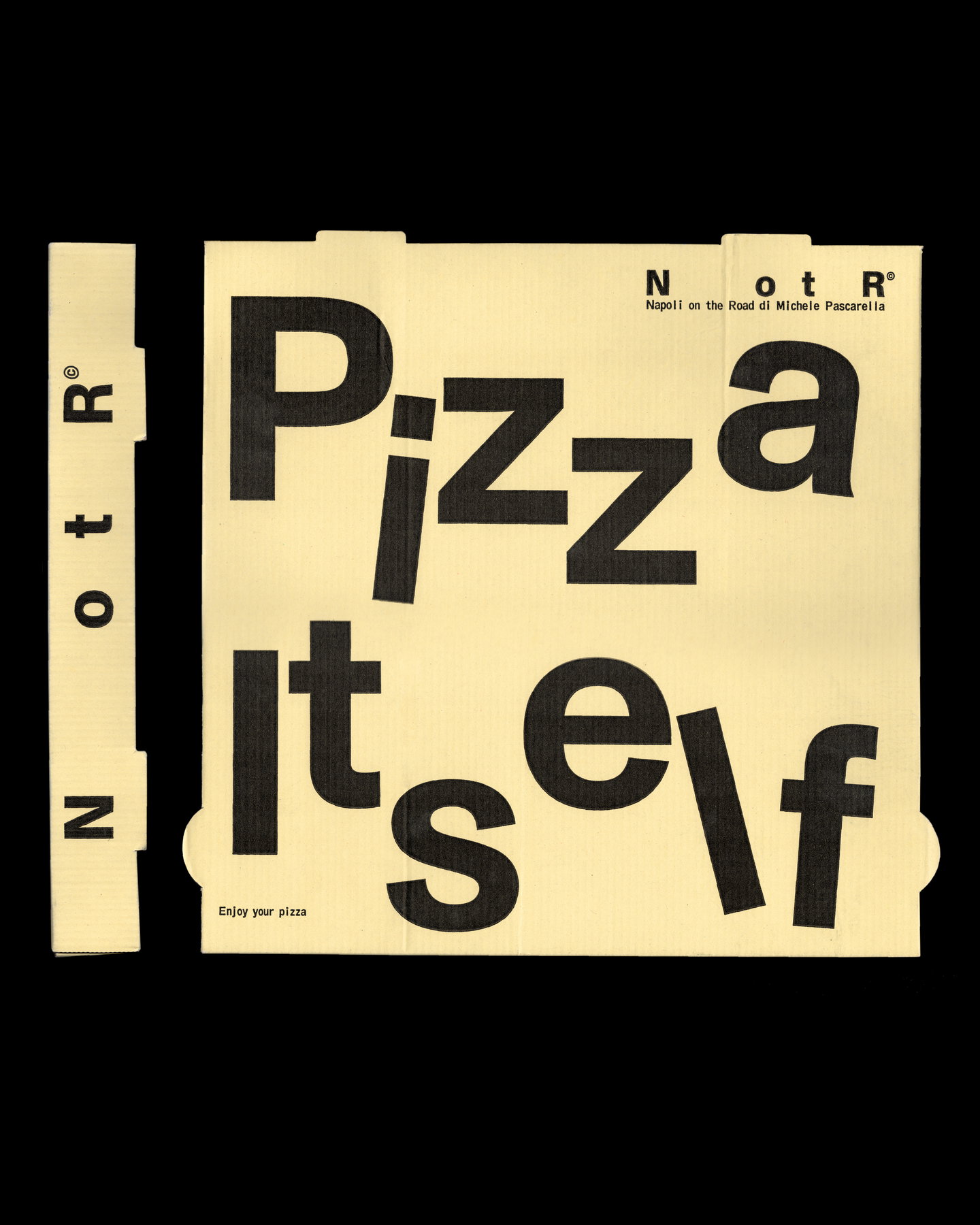
Antwerp studio Vrints‑Kolsteren has reframed the story of Napoli on the Road — a business that grew from a neighbourhood pizza truck into a multi‑site London restaurant — by distilling its identity into a compact, transport‑inspired system now called NotR. The redesign rejects clichéd Italian motifs in favour of an aesthetic drawn from logistics: stamps, labels, monospaced typography and the visual language of movement.
From food truck to flexible brand architecture
Vrints‑Kolsteren’s brief was not simply to freshen a logo but to translate a trajectory: a business “on the road” that has evolved into an entity occupying food, culture and commerce. The studio reduced the name to NotR, keeping negative space as a deliberate trace of the original title — a move that signals both continuity and refinement. That restraint is the foundation for a system that needs to work across disparate touchpoints: pop‑ups, permanent restaurants, packaging, uniforms and cultural collaborations beyond hospitality.
Operational cues become visual cues
Rather than leaning on expected signifiers of Neapolitan identity, the project borrows from transport, shipping and industrial graphics. Stamps and label lock‑ups create modular assets; monospaced, utilitarian typefaces give information hierarchy a functional, almost technical register; and barcode‑like marks and spacing communicate motion rather than geography. Applied to pizza boxes, menus and staff kit, these elements produce a coherent, workmanlike look that reads equally at a distance and in close‑up — useful for a brand whose presence moves between streets, venues and cultural platforms.
The outcome is a deliberately neutral, adaptable identity that foregrounds system over ornament. By avoiding colourful, illustrative clichés the design leaves room for NotR to sit alongside fashion and music projects without appearing secondary or novelty. At the same time, the industrial reference points carry an emotional logic: they feel like objects of travel and exchange, echoing the restaurant’s origins in a truck and its ongoing mobility.
Why this matters for hospitality operators and creatives: the NotR case demonstrates the strategic value of building identity systems that mirror business model and ambition. When a hospitality brand grows beyond a single site or concept, a reductive, flexible identity — rather than an image‑led one‑off — enables consistent recognition across formats and collaborations. Designers should consider operational metaphors (logistics, ticketing, wayfinding) as fertile territory for visual systems that need to be resilient, legible and culturally portable; operators should prioritise identities that scale as the business moves into new contexts and disciplines.