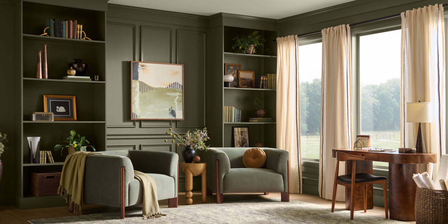
Behr Paint has named “Grounded,” a warm, mossy olive with brown undertones, as its 2027 Colour of the Year and used Montage Healdsburg in Sonoma as the hospitality example that embodies the shade. The reveal, timed to the brand’s tenth anniversary of the annual programme, frames Grounded as part of a natural, tactile palette intended to deepen a sense of calm and connection to place.
Colour as a placemaking device
Behr’s choice positions colour not as a fashionable accent but as an organising idea that links architecture, materiality and landscape. Grounded reads as a tonal anchor that sits comfortably beside timber, stone, aged metals and large expanses of glazing—the very ingredients Montage Healdsburg uses to fold vineyard and oakland vistas into its interiors. The manufacturer presented the shade within a curated palette of complementary blues, browns and muted yellows, underlining that the intent is cohesion rather than a one-off statement hue.
What hotels can learn from the reveal
The event itself—staged at Montage Healdsburg after a planned Big Sur presentation was moved—functions as an instructive example of how paint brands and hospitality properties can collaborate to amplify both product and place. For operators, Grounded highlights a practical trend: selecting colours that respond to the immediate environment and the property’s architectural DNA makes a hotel feel particular to its site, rather than part of a homogenous global roll‑out. For designers, the shade’s brown undertones are a reminder that warm, desaturated greens can act as neutral backdrops that support richer textures and artefacts without competing for attention.
There’s also commercial logic. A Colour of the Year reveal—especially when paired with a visible hotel partner—creates a narrative that can be repurposed across marketing, guest experience and retail opportunities. Guests who encounter a cohesive palette in a stay are likelier to seek out the paint, textiles or furniture that reproduce that feeling at home; brands and operators can monetise that curiosity through retail paint lists, curated takeaways or styled suites that double as showrooms.
Why this matters to hospitality operators and creatives
For hotel owners and designers the Behr announcement reiterates a clear strategic point: colour choices should do work beyond aesthetics. When a palette is derived from landscape, light and material relationships it becomes a tool for storytelling, placemaking and revenue generation. Choosing a dye that harmonises with local vegetation and the property’s material palette reduces the need for heavy decorative intervention, supports longevity in interiors and strengthens a hotel’s claim to authenticity—three outcomes every operator and creative will recognise as commercially and culturally valuable.