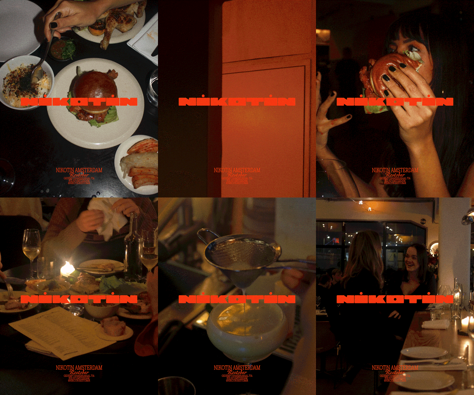
A Bruges-based designer has translated an old tobacco factory’s history into a compact, recognisable visual system for a new Amsterdam restaurant. The identity for Nikotin balances a deliberately literal nod to the site’s past with contrasting, handcrafted elements that speak to the venue’s contemporary, grill-focused offer.
Davy Denduyver created an extended custom logotype whose horizontal proportions subtly reference a cigarette, pairing bold, rounded letterforms with a pared-back colour approach that leans into the restaurant’s bright orange interiors. The project was developed quickly in collaboration with the venue’s interior designer, who favoured a combination of roughness and a retro ‘space-age’ sensibility — a brief that Denduyver resolved by keeping the principal mark clean and geometric while allowing the rest of the graphic system to breathe and feel lived-in.
Designing around provenance: literal versus suggestive storytelling
What makes this commission interesting is how it negotiates provenance without lapsing into pastiche. Early explorations reportedly leaned towards more literal cigarette-brand references, but the final decision was to distil that influence into a single, recognisable silhouette within the wordmark rather than use overt iconography. That restraint keeps the identity readable in small formats and across signage, while still offering a strong, single visual idea rooted in the building’s former use. The result is a brand mark that is immediate and memorable without dominating the guest experience.
Handmade type as a counterpoint to a precise logotype
To offset the logo’s controlled geometry, Denduyver introduced an analogue, hand-drawn script for menus and supporting collateral. Produced with India ink and deliberately left imperfect — the designer describes it as having a napkin-sketch spirit — this handwriting injects texture and informality. It aligns with the restaurant’s grill-based cuisine and the tactile rituals of dining out, framing the digital and commercial language of branding with a human, analogue sensibility. Using two opposing typographic voices — one engineered and one improvised — creates a useful tension that feels both modern and approachable.
The identity also responds to interior colour choices: even though Denduyver initially avoided replicating the established orange palette, he incorporated it once it proved essential to the space’s personality. The interplay of vivid interior colour, a stark geometric wordmark and warm, grubby handwritten elements gives the whole system an energetic, slightly irreverent tone suited to a nightlife-oriented bar and restaurant.
Why this matters: For hospitality operators and creatives, Nikotin demonstrates how to honour a site’s backstory in branding without allowing nostalgia to overwhelm functionality. A single, well-considered motif can anchor recognition across applications, while contrasting tactile graphic treatments preserve atmosphere and guest intimacy. The case reinforces a practical lesson: marry a clear visual concept with adaptable, human-led supporting elements to make a hospitality brand that reads strongly at first glance and still feels welcoming in person.