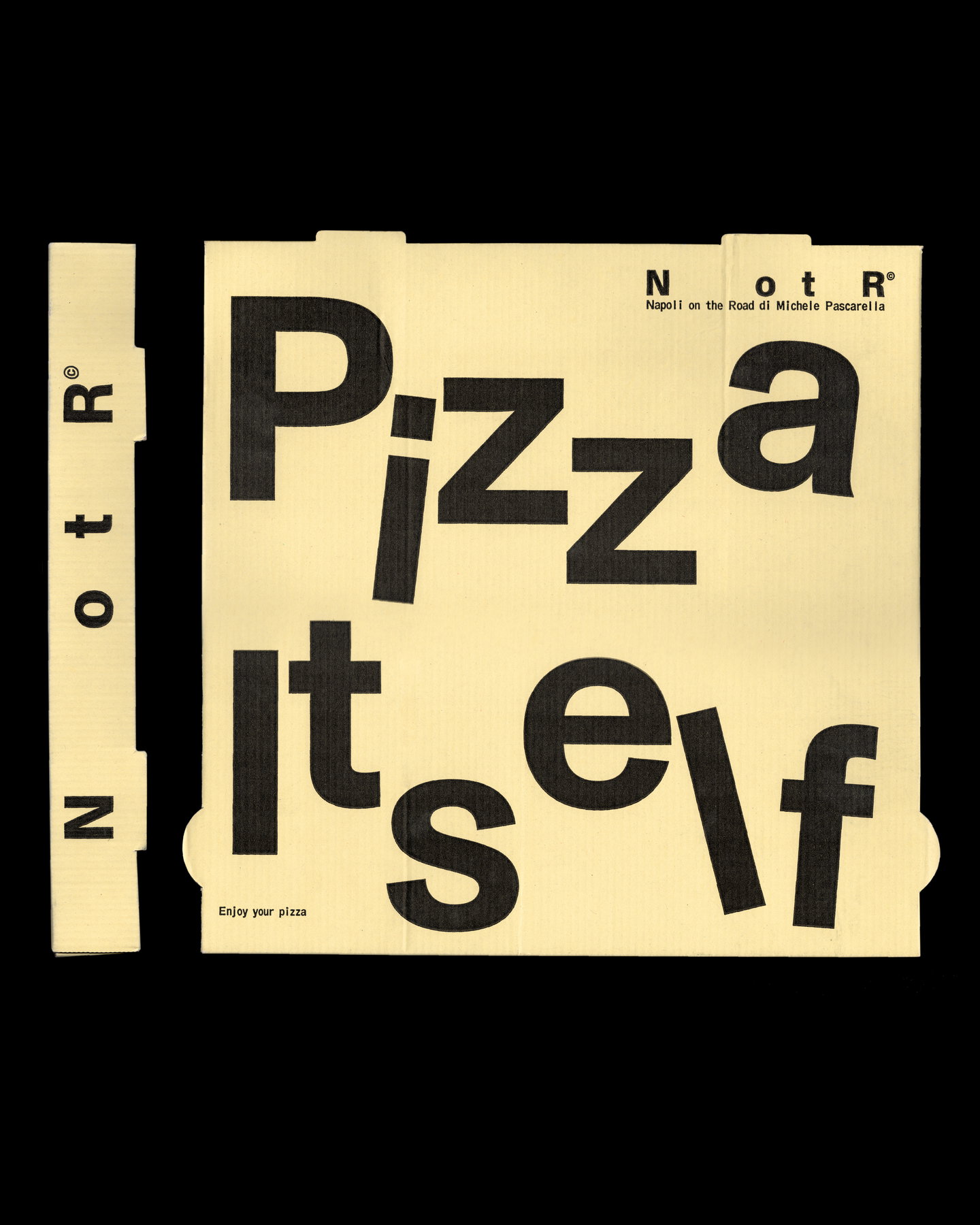
Vrints‑Kolsteren’s rebrand for Napoli on the Road — shortened to NotR — reframes a neighbourhood pizza truck’s evolution into a contemporary, culture‑forward restaurant group. By drawing on visual cues from transport, shipping and industrial labelling rather than traditional Italian tropes, the team has turned the idea of motion into a coherent identity that works across packaging, print and apparel.
Stripping back the name to amplify history
Reducing “Napoli on the Road” to the compact moniker NotR is at once an economy and a strategic gesture. The new shorthand keeps the brand legible and flexible for use across small lockups, stamps and merchandise, while the deliberate spacing between letters signals absence rather than erasure — a visual hint that the longer name and its backstory still exist offstage. That kind of negative‑space storytelling does two practical things: it modernises the mark for digital and physical applications, and it preserves continuity for existing customers who recognise the origin story of a business that began as a food truck.
Industrial cues as a bridge to culture
Rather than leaning on expected palette and scripts associated with Italian dining, the identity borrows from logistics — monospaced type, stamp motifs, label systems and coded lockups. This choice reframes “being on the road” as a set of operational and cultural associations: transit, systems, movement and communication. It’s a tidy way of translating a literal history into a visual language that reads as minimal and functional, yet is textured enough to appear at home in contexts beyond hospitality, such as fashion, music and art — all arenas the client has signalled interest in pursuing.
The approach also unlocks pragmatic benefits. A label‑inspired system scales across menus, pizza boxes and staff uniforms without resorting to decorative illustration, which can be costly and inconsistent across production runs. The visual emphasis on stamps and codes makes packaging a recognisable touchpoint in the customer journey, turning the ubiquitous pizza box into a carrier for brand identity rather than a passive container.
Conceptually, the project illustrates how restraint can support brand extension. By focusing on functional aesthetics associated with transport and industry, the studio has created an identity that comfortably straddles hospitality and culture. The result feels intentional: contemporary rather than performative, and designed with an eye to future collaborations and retail‑facing opportunities.
Why this matters to hospitality operators and creatives: the NotR rebrand demonstrates that identity design can be both economical and expansive. Operators seeking growth should consider reduction and systemisation as tools for longevity — a compact, adaptable mark coupled with clear graphic rules will scale more easily into new venues, products and cultural partnerships than a thematically literal or overly decorative identity. For designers, the project is a reminder that lateral references (logistics, labels, stamps) can yield a richer cultural footing than predictable genre cues.