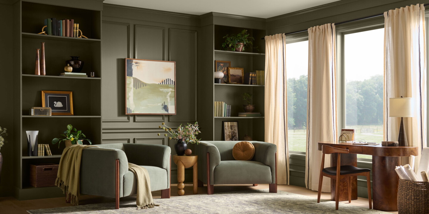
Behr Paint has named “Grounded,” a warm mossy olive with brown undertones, as its 2027 Colour of the Year and chose Montage Healdsburg as the hospitality example that embodies the shade and its wider indoor–outdoor design sensibility. The announcement, made during Behr’s 10th annual reveal, frames Grounded as part of a natural, tactile palette intended to deepen a sense of calm and place.
Colour as context, not costume
Behr’s selection of Grounded continues a practical trend in hospitality design: colours are being chosen to articulate a site’s landscape and light rather than to impose a globalised “look.” According to Behr’s colour lead, the company combines consumer trend data with creative forecasting to nominate a single shade that will feel contemporary across homes and public spaces; the company placed the reveal at Montage Healdsburg to underline the relationship between palette and place. Using an olive with earthy undertones permits layering of wood, stone, aged metal and textiles so interiors feel like curated extensions of surrounding vineyards and oak groves rather than decorative backdrops.
Montage Healdsburg as proof of concept
Montage Healdsburg, the Sonoma resort chosen to exemplify the colour, already leans into destination-driven design: bungalow-style rooms with floor-to-ceiling glass, material palettes drawn from the vineyard landscape and communal spaces that foreground outdoors views. That architecture and the resort’s use of greens, browns and neutrals make it a convenient case study for how a single “hero” colour like Grounded can be woven into linens, rugs and joinery without feeling literal or gimmicky. Behr’s team emphasised that the shade works as well in a private residence as in a resort setting, signalling its commercial versatility for both hospitality and retail paint projects.
There’s also an operational subtext: the Colour of the Year announcement highlights the marketing value of a well-chosen palette. For brand teams, an endorsed shade—especially one linked with a recognised hotel—becomes a storytelling device that can be used in photography, guest communications and retail merchandising, potentially inspiring guests to reproduce the look at home after their stay. The event’s relocation from Ventana Big Sur because of fire damage further reminds operators how sensitivity to local conditions and timing can affect brand storytelling.
Why this matters to hospitality operators and creatives: a deliberate, landscape‑aware colour strategy offers an affordable way to sharpen a property’s distinctiveness and guest perception of authenticity. Adopting a grounded, nature-derived hue reduces friction when pairing with durable materials and ageing finishes, simplifies procurement for FF&E teams, and supplies a coherent visual language for marketing. For designers, Grounded is a reminder that restraint and material interplay often outlast trend-driven accent colours when the goal is to make a place feel specific to its context.