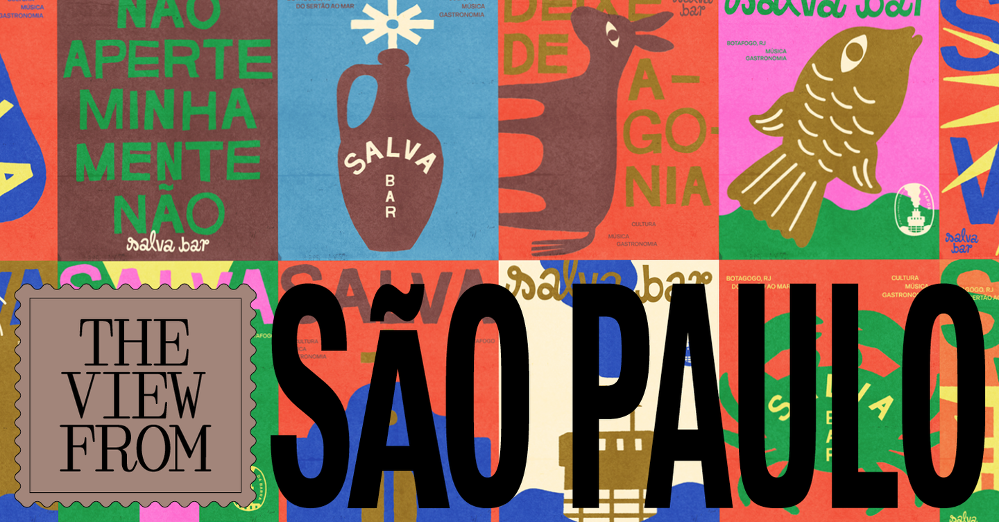
São Paulo’s recent wave of bar and restaurant identities rejects the cool restraint of geometric minimalism in favour of warm, analogue-inflected visual languages. Designers in the city are mining vernacular sources — from hand-painted signage and cachaça labels to flexographic fruit boxes and market lettering — to create branding that feels textured, local and unexpectedly playful.
From geometric polish to vernacular warmth
For much of the last decade São Paulo’s hospitality sector favoured pared-back, typographic systems: neat letterforms, fragments of type, and abstract patterning. The new tendency flips that script. Studios are embracing irregular outlines, misregistration, layered colour blocks and type that reads like it was carved, printed or painted by hand. Projects such as Estúdio Caxa’s work for Exquisito draw explicitly on cheap printed packaging and market signage; Arado’s identity for Cervejaria Duas Irmãs leans on early 20th‑century commercial framing and portraiture; while Estúdio Sarau’s Bar Ovo borrows the ornate visual grammar of lithographic labels. The result is branding that signals conviviality and craft rather than refinement alone.
Technique, storytelling and physicality
What unites these identities is a focus on technique as narrative. Rather than masking production traces, designers emphasise them — halftone gradients, patchy blacks, brush-like strokes and analogue photo aesthetics all become storytelling devices. These choices extend beyond logos into menu design, wall art and signage; at Duas Irmãs the menu is painted directly on the wall and the storefront features hand-painted signage, reinforcing an impression of embeddedness in place. Typography is often bespoke, pulled from vernacular forms and adapted into typefaces or typographic medleys that intentionally oscillate between legibility and character.
There is also a pragmatic reading to this revival. Many São Paulo commissions remain low budget and locally focused, producing projects that are experimental in concept but sometimes uneven in execution. The playful, retro vocabulary can be more forgiving of on‑site variability — a misprinted flyer or hand‑lettered menu sits comfortably within the aesthetic — yet it still demands careful application to avoid tipping into cliché or inconsistency. When well executed, these systems amplify a venue’s personality; when poorly implemented, they can look like pastiche.
For designers this shift opens fertile ground: a richer material palette, opportunities for bespoke type and illustration, and multi-sensory brand systems that integrate signage, packaging and spatial graphics. For operators it offers a way to communicate authenticity and local roots in a dense market, but it also places a premium on craftsmanship and consistent implementation across touchpoints.
Why this matters to hospitality operators and creatives: in a city where competition is intense, branding that foregrounds craft, locality and tactile experience can meaningfully differentiate a venue. Operators gain atmospherics that attract attention and encourage dwell time; creatives gain a brief that privileges research, material thinking and cross-disciplinary execution. Both must plan for the practicalities of production and upkeep — painted walls, bespoke prints and analogue techniques require different budgets, timelines and maintenance than digital-first, minimalist systems — but when aligned, retro-informed identities can convert visual warmth into real-world loyalty.