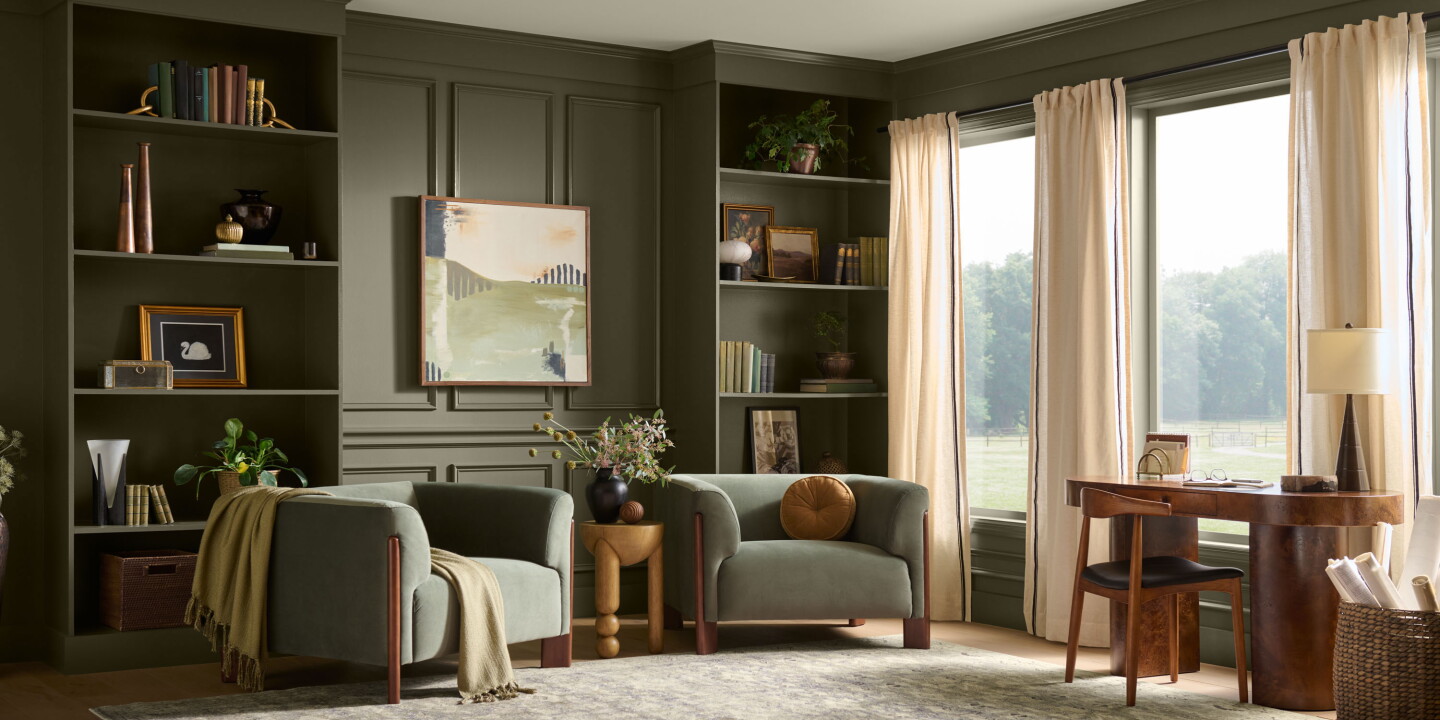
Behr’s 2027 Colour of the Year, Grounded, is a warm, mossy olive introduced amid the oak and vineyard landscape of Montage Healdsburg. The pick — revealed as part of Behr’s tenth anniversary Colour of the Year programme — was presented by the brand’s colour team as a tonal anchor that pairs with tactile woods, stone and aged metal to create a quieter, place-specific expression of calm.
From landscape to palette: Grounded as a place-making device
Grounded is framed not as a standalone trend colour but as a connective tissue between architecture, materiality and context. Behr’s colour leads describe it as an olive with brown undertones, intended to feel at home beside natural textures and abundant glazing. That positioning matters: instead of declaring a radical new hue, the choice confirms a larger trajectory in hospitality design that privileges restraint, durability and the translation of local landscape into an interior language. At Montage Healdsburg — chosen by Behr to exemplify the shade — floor‑to‑ceiling glass, wood finishes and vineyard views make the colour feel less applied and more endemic: an extension of the exterior rather than a decorative overlay.
Practical deployment: how hotels can use an earthier green
Practically, Grounded functions well at multiple scales. As a wall colour it creates an enveloping backdrop that moderates light and heightens the perception of texture in furniture and linens; as an accent it can anchor soft furnishings, joinery and public‑space built elements without competing with natural vistas. The Montage example points to a strategy of layering — pairing the green with warm neutrals, tactile textiles and metalwork — rather than relying on saturated contrasts. For operators and designers working to balance durability and atmosphere, this is a useful reminder: naturalistic palettes can mask wear, reduce perceived maintenance and support a slower, more deliberate brand expression that ages gracefully.
There is also a guest psychology angle. The narrative around Grounded explicitly ties the colour to a deeper, richer calm — the “exhale” moment as daylight fades. Colour choices that evoke that sensation can be leveraged in wellness programming, spa zones and long‑stay accommodation, where sustaining relaxation and connection to place improves perceived value and guest loyalty.
Why this matters to hospitality operators and creatives
For operators, the announcement is more than a seasonal marketing cue: it reaffirms a commercially sensible design direction that aligns guest expectations with operational longevity. For creatives, Grounded offers a conservative but flexible tool for storytelling — one that supports place‑specific programmes and invites material-led detailing over fleeting novelty. In short, the choice validates a hospitality aesthetic focused on rootedness: environments that feel curated by their surroundings and that reward investment in quality materials and thoughtful colour choreography.