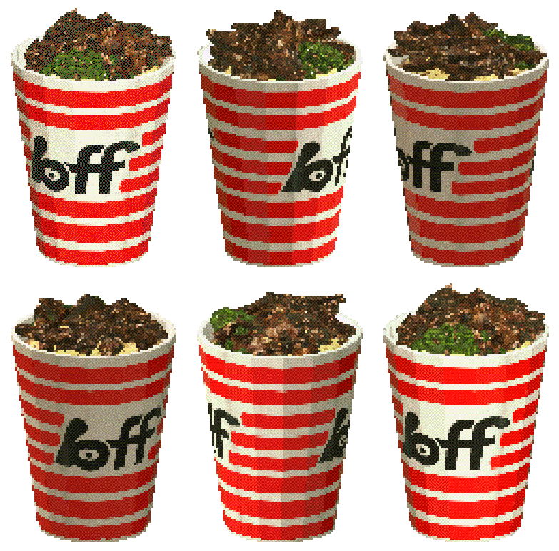
BAO’s new BFF project reframes fast food by borrowing visual shorthand from convenience stores and arcade culture. The identity, developed with studio Hato, strips back fast‑food spectacle in favour of bright, functional graphics and an open‑source approach to brand assets — a deliberate move that treats branding as part of the offer rather than a separate gloss.
Launching experimentally as a pop‑up in Taipei this June, BFF (BAO Fast Foods / Better Fast Food / Best Friends Forever) positions itself as a convenience‑store‑inspired service rather than a traditional restaurant chain. The creative team explicitly referenced the ubiquity of convenience stores across Asia — their hybrid role as takeaway provider, social hub and small‑scale retailer — and translated those behaviours into an identity that reads as immediate and everyday rather than aspirational. Colour, typography and iconography are pared back to do heavy lifting in high‑frequency retail environments: visible from a distance, easy to reproduce on packaging and at point‑of‑sale, and adaptable to rapid regional roll‑outs or collaborations.
Design that prioritises utility and play
Where many hospitality brands rely on bespoke type and layered narratives, BFF’s visual language privileges systems: modular logos, bold badges, and cartoony, utility‑driven graphics that speak directly to quick transactions and repeat visits. The work nods to fast‑food branding through immediacy and scale, but its references to convenience‑store signage — product categories, shelf‑ready colour blocks and functional pictograms — ground it in everyday usage. Hato’s involvement brought a measured restraint; the result reads as playful rather than gimmicky, with a clear operational brief embedded in aesthetic choices. The identity also embraces retro digital textures in places, a wink to arcade and pixel culture that helps the project feel youthful without relying on trend‑heavy tropes.
Open‑source identity as a strategic choice
A standout commercial decision is BFF’s open‑source stance for parts of the brand toolkit. Making assets available for reuse lowers barriers for collaborators and franchise partners, and signals a different relationship between brand guardians and local operators: one of shared authorship rather than top‑down control. For a concept conceived as a flexible convenience lab — testing products, formats and collaborations — this approach accelerates adaptation and cultural resonance. It also reframes reproducibility as a strength, not a dilution, which is key when the business model relies on scale, speed and local iteration.
Why this matters to hospitality operators and creatives: BFF demonstrates that fast‑moving food concepts benefit from identities designed to work as operational tools. For operators, the tidy, reproducible graphics make roll‑out and merchandising cheaper and faster; for designers, the project is a reminder that intention — about visibility, modularity and local adaptation — should guide visual exuberance. The move to open‑source portions of the identity also presents a practical template for brands that want regional partners to act as co‑creators, reducing friction while preserving a coherent visual system. In short, BFF is as much a playbook for fast, scalable hospitality design as it is a new food concept.