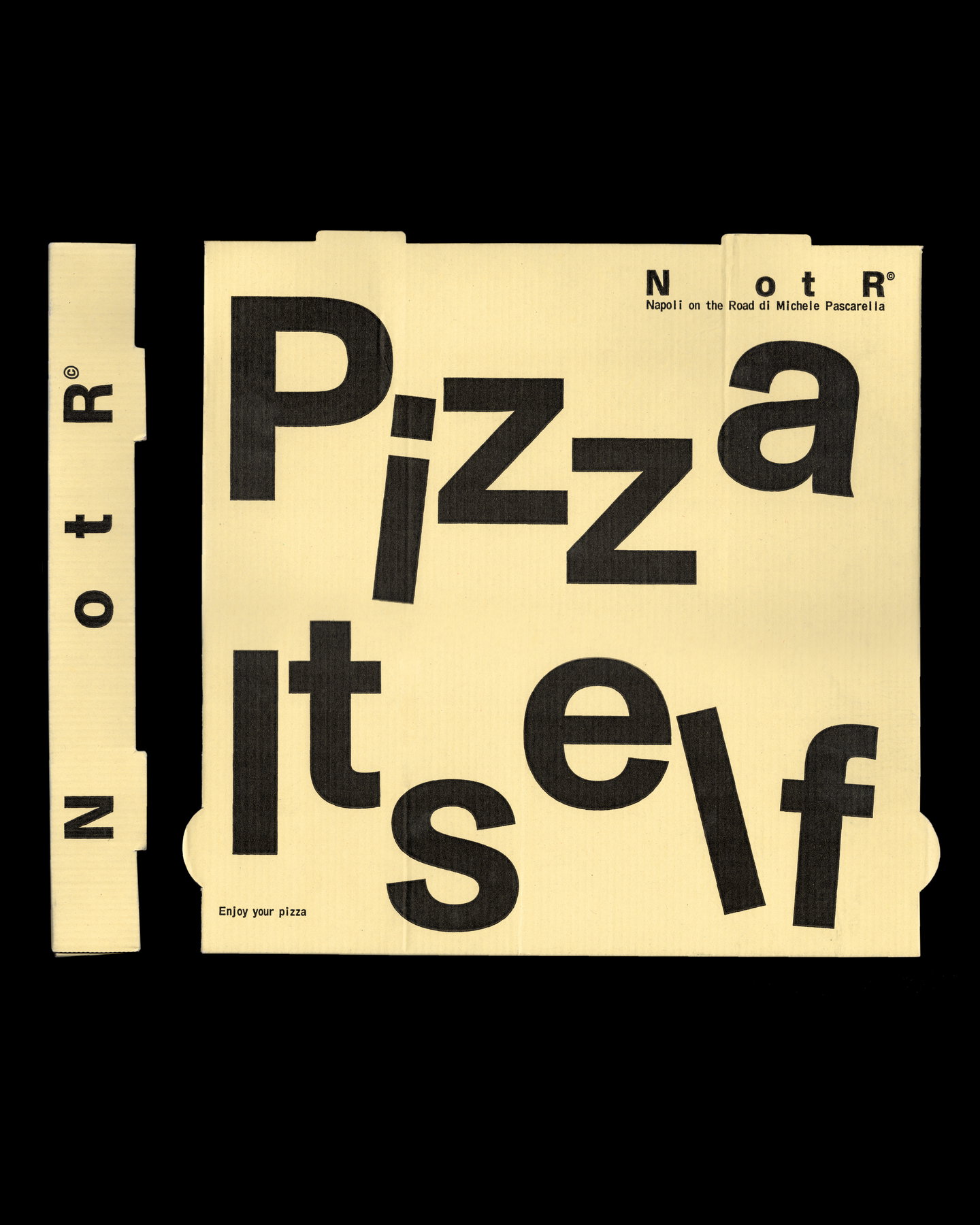
Antwerp studio Vrints-Kolsteren has reimagined the visual identity for Napoli on the Road (NotR), a London-born pizza concept that has grown from a neighbourhood food truck into a multi-site, award-winning restaurant. Rather than leaning on familiar Neapolitan tropes, the new identity borrows visual language from transport, logistics and industrial labelling—stamps, parcel codes and pragmatic stickers—to give the brand a feeling of motion and utility that reflects its origins and ongoing evolution.
The rebrand pivots away from the expected trattoria aesthetic. Instead of hand-drawn illustrations, calligraphic scripts or tricolour palettes, the studio foregrounds typography, modular marks and coded graphics that read like shipping artefacts. The pizza box is treated as an active canvas: its structure and surfaces are used as an architectural component of the identity system, freighted with stamps and numeric systems that make packaging feel like a logbook of journeys rather than merely a container for food.
Utility as personality
What makes this work is the deliberate elevation of functional visual cues into brand personality. Stamps, labels and routing marks are traditionally read as procedural — they tell you where something has been, how it should be handled, which lane it belongs to. Vrints-Kolsteren repurposes those signals as storytelling devices: a tactile, slightly bureaucratic vocabulary that communicates both provenance and momentum. It’s a clever inversion, where the mundane signage of transport becomes the expressive vocabulary of hospitality.
System thinking over single-image logos
Underlying the aesthetic is a systems-first approach. Rather than a single hero logo or a set of decorative assets, the identity behaves as a toolkit that can be applied across a wide range of touchpoints: pizza boxes, staff aprons, menus, wayfinding and digital channels. Modular typographic treatments and code-like marks enable the brand to scale consistently across three distinct restaurant locations while retaining the raw energy of its food-truck beginnings. This makes the identity legible whether it’s stamped on corrugated cardboard or displayed on a window vinyl.
The choice to foreground industrial references also signals a broader positioning: NotR is less about nostalgia and more about movement, craft at speed and urban circulation. The identity’s restrained colour and graphic economy keep the focus on product — the pizza itself — while the utilitarian graphics provide an immediately recognisable exterior vocabulary that cuts through the crowded London food scene.
Why this matters to hospitality operators and creatives: the project exemplifies how a hospitality identity can be rooted in behaviour and business history rather than surface aesthetics alone. For operators, it demonstrates the value of a flexible, systemised identity that grows with the business and adapts to new formats and sites. For designers, it’s a reminder that personality can be engineered from the logic of an operation—movement, logistics and repetition—turning functional cues into distinctive brand signals without resorting to clichés.