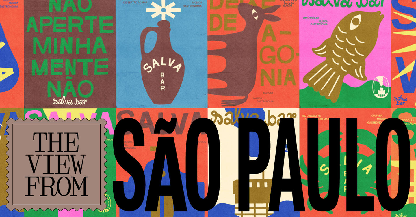
A fresh wave of retro-influenced identities is reshaping São Paulo’s food-and-drink scene, trading the cool minimalism of the last decade for warmer palettes, playful typography and tactile craft references. Designers and proprietors are leaning on local printing traditions, vernacular graphics and nostalgic tropes to give new venues an immediate sense of personality and familiarity.
Visual language rooted in the everyday
Rather than resurrecting a single historical moment, recent projects in São Paulo harvest a broad visual vernacular: grocery-packaging type, hand-painted signage, flexographic textures and mid‑century wordmarks all reappear in surprising mixes. Designers are borrowing from the city’s material culture — fruit crates, restaurant stickers, regional literature covers — to create identities that feel like rediscovered objects rather than manufactured corporate assets. The result is branding that works as both wayfinding and storytelling, signalling a locality of taste while inviting curiosity from passersby.
Playfulness as a business strategy
These retro approaches do more than look good: they alter how guests perceive an operation’s intent. Multiple wordmarks, illustrative motifs and a looser approach to logo hierarchy foreground experience over scale, encouraging experimentation across menus, posters and in‑venue ephemera. For bars that foreground vinyl, for example, circular motifs and simplified record imagery become recurring visual cues; for restaurants referencing northeastern Brazilian culinaria, type and artefact references anchor a menu in a recognisable cultural lineage. This flexibility lets small operators cultivate authenticity without overinvesting in a single, static brand asset.
The movement also gestures at a reaction against the globalised, antiseptic aesthetics that dominated recent hospitality launches. Where minimalist white boxes promised neutrality, retro branding restores warmth and imperfection — visible ink halftones, hand‑drawn flourishes and uneven edges — signalling craft, conviviality and human labour. That tactile quality plays well on social media too: tactile textures and quirky marks give photographers something to frame beyond food shots, amplifying organic promotion.
Why this matters for operators and creatives: For hospitality operators, the turn to retro branding is a pragmatic tool for differentiation in a crowded market — it creates recognisable atmospheres that can be iterated across physical and digital touchpoints without the cost of high‑gloss renovation. For designers and studios, São Paulo’s moment demonstrates how culturally specific references and material processes (from flexography to hand‑painted signage) can be translated into contemporary systems that feel both relevant and rooted. Embracing imperfection and narrative gives venues more than a look; it gives them a reason to be noticed and remembered.