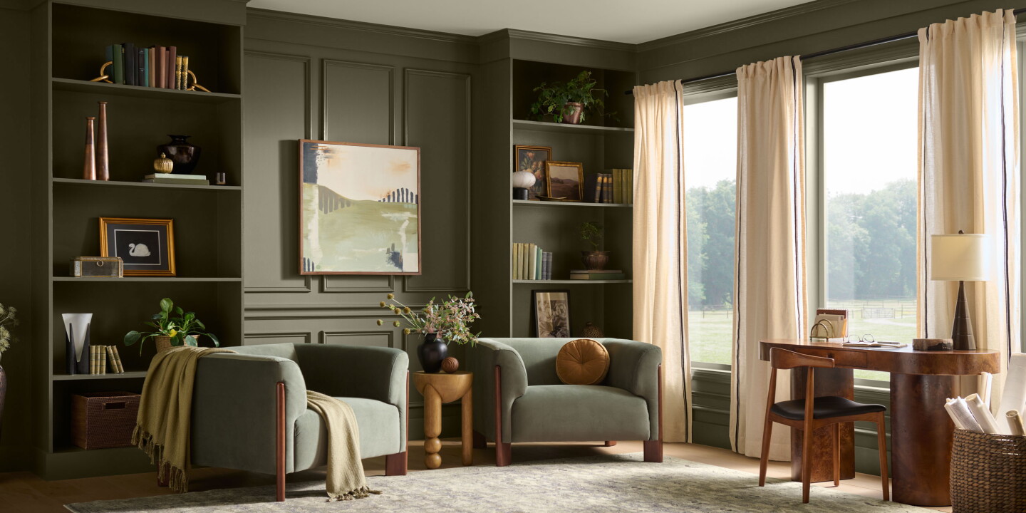
Behr’s 2027 Color of the Year, Grounded, is a mossy olive with brown undertones that the paint brand unveiled this summer and showcased at Montage Healdsburg. AFAR’s report highlights how the shade and its accompanying palette lean into a hospitality trend that pulls the outdoors inside — a direction increasingly visible across new-build resorts and retrofit projects aiming to feel both local and restorative.
Colour as place-making, not decoration
Grounded is more than a single swatch; it’s a positioning choice. By selecting an earthy olive for its tenth anniversary Color of the Year and nesting the reveal in Sonoma, Behr underlines colour’s role in anchoring a guest experience to a landscape. In practice, using a dominant, site-referential hue shifts a room’s role from neutral backdrop to narrative device: walls become part of a region’s visual story rather than a blank canvas. For hotel design teams that want authenticity without pastiche, a restrained natural tone like Grounded can harmonise with existing materials — wood, leather, unglazed ceramics — while allowing textiles and art to inject personality.
Practical implications for operations and refurbishment
For operators, the appeal of a nature-rooted palette is operational as much as aesthetic. Olive and moss tones hide wear better than pale neutrals, reducing the visual impact of scuffs and stains in high-traffic areas. They also pair well with low-maintenance finishes and surfaces sourced from more sustainable supply chains, dovetailing with many brands’ ESG commitments. When planning a refresh, specifying Grounded-like tones across public spaces, corridors and suites creates a coherent guest journey; staged accents—linen, rugs, artwork—can then be rotated seasonally or by campaign without disrupting the core identity.
Design consultants should note the light-sensitivity of deeper greens: in small or north-facing rooms the pigment can read heavy unless balanced with reflective surfaces, lighter ceilings, or strategic daylighting. Conversely, in buildings with generous glazing and external greenery, the colour functions as a seamless interior extension of the view. The Montage Healdsburg example that AFAR cites demonstrates this: floor-to-ceiling glazing and vineyard vistas make the olive feel inevitable rather than applied.
Behr’s publicity move also signals an important commercial dynamic: paint manufacturers now curate lifestyle narratives, not only product specifications. Pairing a colour announcement with a hotel case study gives specifiers a lived example to reference, accelerating adoption in hospitality briefs and residential projects alike.
Why this matters to hospitality operators and creatives: Choosing a signature colour like Grounded is a quick, cost-effective lever to articulate place and reset perception without major capital works. For operators chasing distinctions that feel authentic — and for designers constrained by budgets or timelines — a disciplined, landscape-informed palette delivers both visual cohesion and practical durability. Grounded is a reminder that colour strategy remains one of the most efficient tools to translate a brand’s relationship to site into the guest experience.