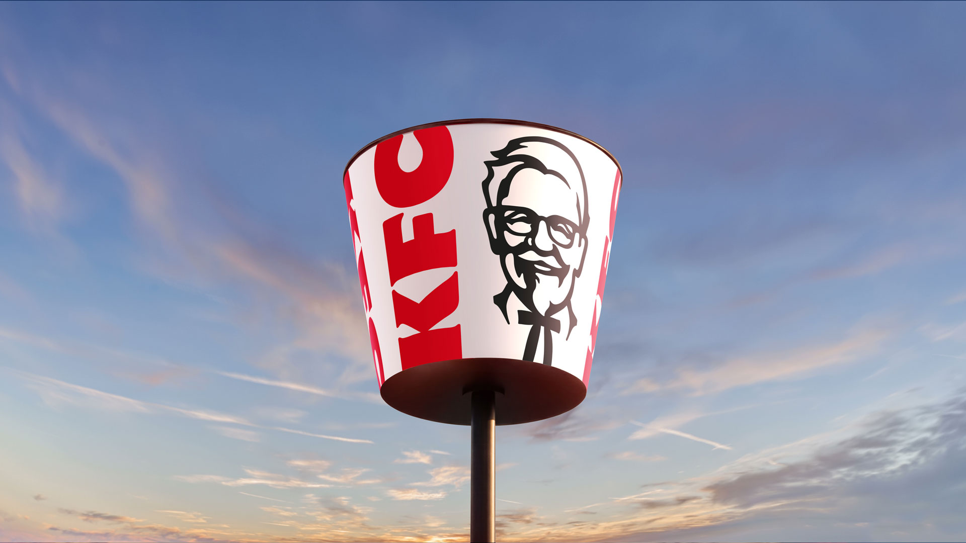
KFC has unveiled a global rebrand that places its most recognisable asset—the red-and-white bucket—at the centre of a newly unified visual and experiential system. Developed with Jones Knowles Ritchie (JKR) and KFC’s in‑house teams, the refresh stretches from logo and packaging to restaurant interiors, digital touchpoints and menu positioning, signalling a strategic push to modernise the brand while foregrounding its core product.
The decision to make the bucket the organising device is both pragmatic and symbolic. Practically, the bucket is a universally understood container for KFC’s product, lending itself to modular design treatments across scale and media. Symbolically, elevating that object into a “Bucketverse” allows the brand to anchor narratives and activations around a single, emotive touchstone. The refresh tightens brand architecture: the Colonel and typographic marks are refined rather than discarded, while a wider palette and motion-led identity give the system greater flexibility in global and local executions.
Design choices that favour system over slavish nostalgia
Rather than revert to retro cues or pursue a radical mascot overhaul, the rebrand opts for subtlety. The Colonel’s likeness has been updated to perform cleanly in digital and physical environments; typography and colour shifts are calibrated to improve legibility and consistency across packaging and in‑store signage. Importantly, the new identity is motion-first—the bucket acts as a framing device for animation, hero imagery and photographic crops—helping the brand feel more dynamic on screens and in social formats that skew younger. This is a deliberate move away from static lockups towards a composable identity system that can be scaled and personalised for market needs.
Business logic: product-first storytelling and category stewardship
Positioning the bucket at the heart of the rebrand is also a business play. It refocuses attention on KFC’s core offer—fried chicken—at a time when menu innovation, new sauces and beverage platforms are being emphasised alongside dining experience updates. By linking a refreshed visual system to tangible changes in menu and restaurant design, the brand is signalling an intent to lead the fried‑chicken category rather than merely refresh its logo. The global rollout and involvement of regional stakeholders suggest the system was designed for cultural adaptability as much as visual cohesion.
For hospitality operators and creatives, this story is a timely reminder that effective rebrands today must be holistic: identity work needs to serve operations, packaging logistics and digital formats as much as advertising. The KFC approach demonstrates how an iconic physical artefact can be reinterpreted as a flexible brand engine—one that supports product storytelling, simplifies localisation and creates more engaging moments across channels. For operators, the lesson is to align brand signals with menu and service changes; for designers, it’s to build systems that translate as fluently in motion and retail as they do on a logo sheet.