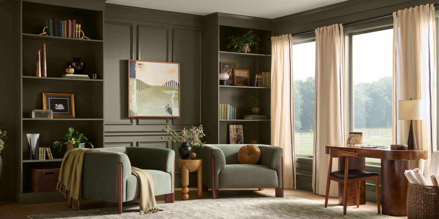
Behr Paint has named “Grounded” — a warm, moss‑leaning olive with brown undertones — its 2027 Color of the Year, and chose Montage Healdsburg in Sonoma as the setting to present the shade. The announcement, made as part of Behr’s tenth annual selection, highlights a continued hospitality design movement that brings landscape‑derived palettes and tactile materials into guest environments.
How a colour choice maps onto hotel identity
Grounded is presented not as a stand‑alone accent but as the keystone of a broader natural palette that includes muted blues, warm browns and sun‑washed neutrals. Behr’s colour leadership frames the pick as an expression of calm that carries personality — a deliberate move away from the neutral minimalism that dominated the previous decade. By staging the reveal at Montage Healdsburg, a resort that explicitly references its vineyards, oaks and rolling terrain in both its architecture and interiors, Behr underlines how a single hue can be woven through linens, furniture and public spaces to reinforce a sense of place.
Materials, lighting and the indoor‑outdoor continuum
The reporting on the reveal emphasises that Grounded gains its full effect when paired with specific materials: timber, stone, aged metals and textured textiles. Those pairings are evident at Montage Healdsburg, where floor‑to‑ceiling glass frames the site’s greenery and lets exterior tones read directly into guest rooms and communal areas. The result is a softer, layered calm rather than a sanitised, flat palette — lighting and viewlines become active elements of the scheme, shifting the perception of the colour across the day and deepening its relationship to the landscape.
Behr’s process for choosing a colour, described as a mixture of trend data and creative forecasting, also included selecting a hotel exemplar that “embodies” the shade. The company had originally planned to stage the announcement at Ventana Big Sur but moved north due to regional wildfire impacts; Montage’s vineyard setting served as a practical illustration of how destination‑specific design can make a colour feel authentic, rather than applied superficially.
For operators and creatives in hospitality, this announcement is more than a retail moment: it’s a reminder that colour strategy remains a potent tool for storytelling. Grounded’s appeal lies in its adaptability — used sparingly it can suggest refinement, used broadly it can unify disparate materials — but its greatest strength is how it can anchor a narrative that links room, site and season. In practical terms, adopting such a palette encourages procurement decisions toward durable natural materials and lighting strategies that let colour change across the day, which in turn supports guest experiences that feel both local and restorative.