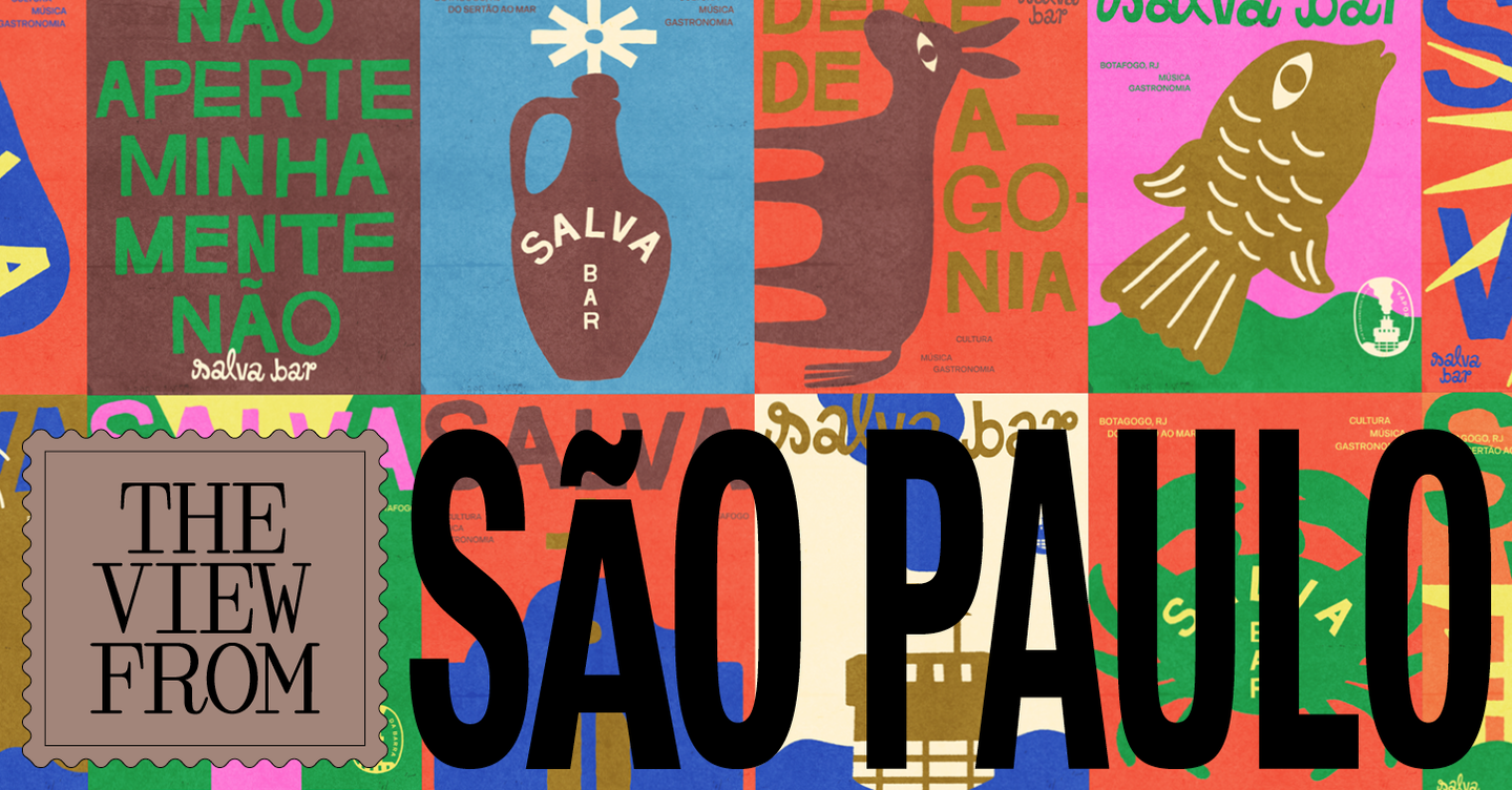
São Paulo’s bar and restaurant scene is leaning into a deliberately nostalgic visual language: colourful, hand-made, and playful branding that references vernacular printing, packaging and signage. Designers are favouring warmth and personality over the pared-back minimalism that dominated recent years, using illustration, textured typography and analogue techniques to create identities that feel lived-in and immediate.
For several studios profiled in It’s Nice That’s dispatch from São Paulo, retro references are not mere pastiche but a researched revival of local graphic traditions. Projects for bars such as Exquisito, Duas Irmãs and Bar Ovo draw on flexographic fruit-box printing, hand-painted shop signs, cachaça labels and rural Brazilian typographies. The trend emphasises bespoke type, irregular outlines and layered misregistration — formal choices that deliberately foreground human error and craft to signal authenticity and conviviality.
Design moves: texture, type and vernacular illustration
Shifts in aesthetic strategy are clear: where previously many identities relied on geometric reduction and refined grids, the new wave leans into texture and narrative. Hand-lettering and custom typefaces inspired by market signage provide verbal character, while illustrative systems — chickens, eggs, portraits, everyday objects — give brands a flexible visual vocabulary that can be recombined across menus, murals and merchandising. Photographic treatments that embrace flash, grain and imperfect exposure further the sense of spontaneity; together these elements create a cohesive, multi-channel identity that feels informal and social rather than corporate.
Practical constraints shaping creativity
Context matters. Designers working in São Paulo are often responding to tight budgets, small-scale commissions and, at times, informal production realities. Those constraints push studios towards solutions that are affordable to implement — hand-painted signs, wall menus, risograph or letterpress runs — and that visibly celebrate their production methods. The result is branding that can be applied directly to interiors and surfaces, becoming part of the physical experience rather than an isolated logo on a menu. That practical emphasis also means identities are adaptable: playful typographic permutations and repeatable illustration sets let owners refresh the look without costly redesigns.
Why this matters to hospitality operators and creatives: the São Paulo example shows that design can be a powerful tool for establishing atmosphere and encouraging repeat visits without requiring large marketing budgets. For operators, embracing idiosyncratic, craft-forward identities helps communicate a human-centred hospitality proposition — warmth, local rootedness and spontaneity — that resonates with diners seeking experience over polish. For creatives, the movement is a reminder to mine everyday visual culture and analogue processes for distinctiveness, and to design systems that are both expressive and easy to implement in real-world, resource-constrained venues.