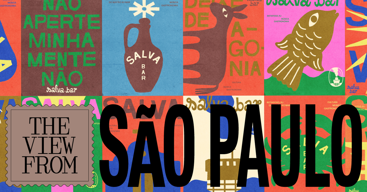
São Paulo’s hospitality scene is enjoying a visual detour: designers and restaurateurs are turning away from antiseptic minimalism and toward a retro-inflected graphic language that feels warmer, looser and more rooted in local print culture. The shift — documented in a recent feature for It’s Nice That — draws on vintage packaging, hand‑painted signage and analogue print techniques to give bars and restaurants a more convivial, human face.
Where the look comes from
Rather than reviving a single era, São Paulo’s new identities mine a range of vernacular references: early‑ to mid‑20th‑century commercial printing, cachaça labels, matchbox art, fruit crate typography and the improvised lettering of neighbourhood signage. Designers are deliberately privileging texture, imperfect halftones and layered devices — gradients made of ruled lines, decorative frames and playful pictograms — that read as tactile and familiar even in small applications like menus and stickers. A recurring strategy is to treat a brand not as one static logo but as a system of playful marks and type treatments that can be mixed across applications, from facades to coasters, reinforcing a sense of discovery rather than uniformity.
How it’s being used in venues
Practically, the aesthetic suits a variety of formats now popular in the city: low‑lit listening bars where vinyl and analog rituals are part of the offer; neighbourhood botecos and bodegas leaning into the ‘rural‑urban’ imaginaries; and gastro‑bars that want to feel handcrafted rather than corporate. In several projects the wordmark itself becomes an act of storytelling — O’s turned into olives for a cocktail bar, or logotypes that mimic letterpress imperfections to suggest hand‑made food and old recipes. Interiors often echo the graphic approach through materials and fittings: warm woods, painted tiles, exposed printing artefacts and printed posters fastened with staples rather than a polished, branded tableau.
There is also a cultural calibration at work. Using local graphic tropes re‑inscribes culinary spaces within a Brazilian visual lineage, subtly resisting homogenised international trends. At the same time, the retro vocabulary can be playful and inclusive, signalling informality and encouraging repeat visits — a vital attribute for venues seeking regulars rather than one‑off tourists.
Why this matters to operators and creatives: the movement demonstrates that brand identity in hospitality is not solely about refinement or scale; it is an experience lever. For operators, a retro‑informed system can communicate authenticity, increase perceived warmth and aid memorability without large capital outlays. For designers, São Paulo’s example underlines the commercial value of local research, modular identity systems and tactile production methods — tools that create character and help venues stand out in crowded urban markets.