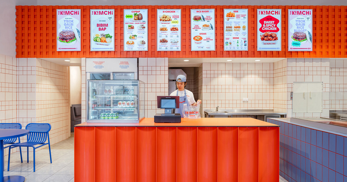
The Kimchi, a new Korean quick-service restaurant in Prague by SOA Architekti, translates the kinetic visual language of contemporary Seoul into a compact European setting. The scheme relies on a disciplined trio of hues — cobalt blue, vivid red and a textured orange — layered over humble materials to conjure movement, contrast and a recognisable national reference without resorting to pastiche.
Colour as structural device
Rather than treating colour as decorative afterthought, the design deploys blue, red and orange as organising devices that shape how the small dining room is read. A dominant blue unifies seating, bespoke tables and selected wall finishes, providing a cool, stabilising ground. White tiled surfaces — an economical, urban material — are animated by saturated red grout that turns the ubiquitous grid into a graphic rhythm, drawing the eye across surfaces and between zones. Above the service counter an industrial orange mesh introduces texture and a third register of warmth; it delineates the kitchen area while allowing sightlines and light to pass through. The result is a compact composition in which chromatic blocks and material seams perform much of the spatial choreography.
Contemporary identity without cliché
The project’s careful restraint is notable: references to Korea are distilled into visual temperament and palette rather than literal artefacts. The colours echo the South Korean flag and the intense, high-contrast aesthetics familiar from Seoul’s street culture and graphic design, but they are always mediated through pragmatic, locally sourced finishes — tiles, timber seating and metal mesh — that sit comfortably within Prague’s architectural grain. This makes the restaurant feel both of its cuisine and of its context: an authentically contemporary Korean street-food counter reinterpreted for a European footprint.
Operational transparency is also treated as a design asset. The open counter, visible preparation area and a clear material hierarchy make watching food being made part of the dining experience, aligning the spatial narrative with a quick-service, street-food model. Bespoke joinery and furniture are kept simple and robust, ensuring that the bold colourwork remains the primary identity marker while remaining durable for daily service.
Why this matters to hospitality operators and creatives
For operators, The Kimchi offers a lesson in how a compact budget and a small footprint can still deliver a strong, recognisable brand presence: disciplined colour and modest materials often outperform expensive surfaces when applied strategically. For designers and brand teams, the project demonstrates how cultural reference can be translated into temperament and graphic gesture rather than signals and props, producing interiors that feel contemporary, authentic and resilient across markets. In other words, a clear colour strategy, thoughtful material pairing and an operationally honest layout can amplify both identity and functionality in hospitality design.