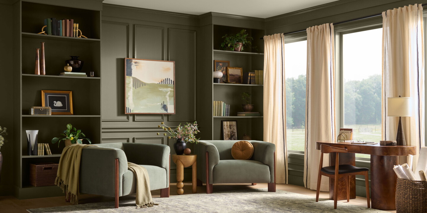
Behr has named “Grounded”—a warm, mossy olive with brown undertones—as its 2027 Colour of the Year and chose Montage Healdsburg in Sonoma as the hospitality exemplar for the palette. The announcement, timed with Behr’s tenth Colour of the Year programme, positions the hue as part of a broader, nature-led interior strategy that stitches landscape, materials and light into a cohesive guest experience.
Behr’s pick feels less like a fleeting accent and more like a tonal framework. Grounded is presented as a unifying anchor that reads differently alongside timber, stone, aged metals and textured fabrics; in practice it moderates brightness, deepens perceived warmth and heightens the tactility of surrounding surfaces. The Montage Healdsburg example underlines this approach: expansive glazing and bungalow‑style architecture let vineyard and oak palettes flow into interiors, so the olive becomes an extension of place rather than an applied trend. For designers, that’s an important distinction — colour here operates as context, not costume.
Practical uses and material pairings
On a practical level, Grounded is adaptable. As a full-room wall colour it creates an enveloping backdrop that softens strong light and helps conceal scuffs or ageing, useful in high-traffic guest rooms and public areas. Used as an accent on joinery, upholstery or metalwork, it provides a warm counterpoint to natural timbers and stone without demanding high-contrast palettes. The shade’s brown undertones mean it leans into autumnal and Mediterranean references, making it a versatile choice for properties that want to read as rooted—vineyard resorts, forest lodges and boutique coastal escapes all benefit from its quietly assertive presence.
Branding, storytelling and guest psychology
Beyond aesthetics, the announcement functions as a narrative device. Linking a Colour of the Year to a named hotel gives hoteliers, marketers and retail partners a ready-made visual story to deploy in photography, merchandising and guest communications. More importantly, the tonal suggestion comes with an implicit guest promise: a curated calm that resonates with biophilic impulses and the modern appetite for restorative stays. Colour choices that evoke an “exhale” moment can be deliberately placed in spas, long‑stay suites and other zones where the goal is sustained relaxation and perceived wellbeing.
For hospitality operators and creatives this matters because a single, well-considered hue can deliver disproportionate value. Grounded validates a restrained, place-led design strategy that is both operationally economical and brand-affirming: it simplifies procurement for FF&E teams, pairs easily with durable finishes, and supports imagery that sells authenticity. In short, adopting a nature‑derived tonal system like Grounded helps properties feel specific to their setting while ageing gracefully — a sound commercial and creative choice in an industry that increasingly prizes rootedness over novelty.